Red Canary Brand Refresh
THE CHALLENGE
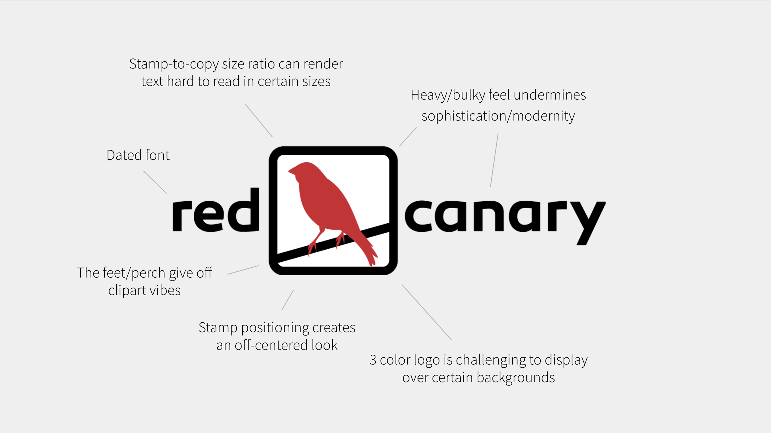
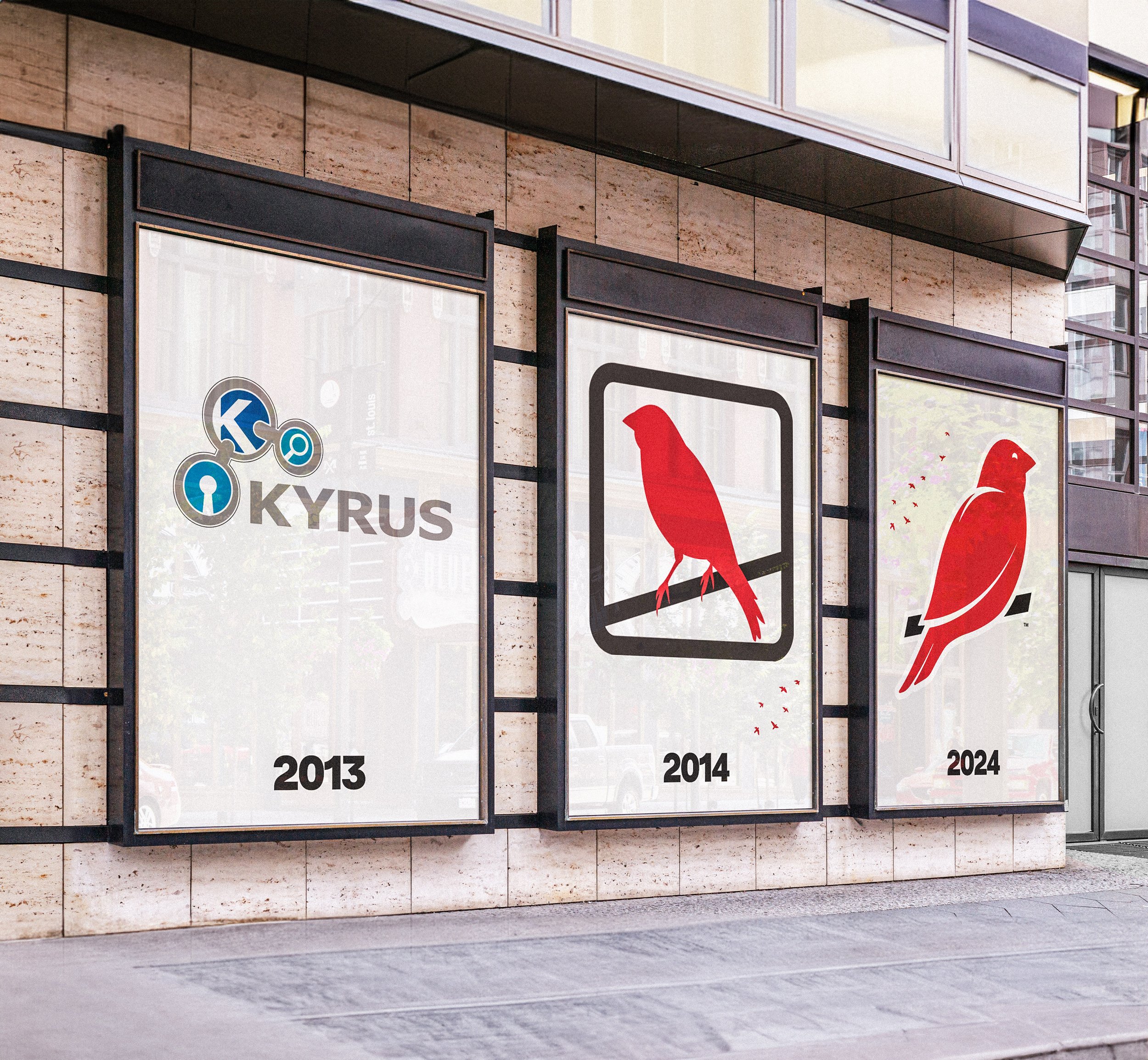
Red Canary needed a clearer, more modern brand identity to stand out in a crowded cybersecurity market. Its existing logo felt bulky and dated, lost detail at small sizes, and was difficult to use across different backgrounds, while its typography lacked impact. The challenge was to evolve the whole visual identity into something distinctive, flexible, and immediately recognizable—without losing the familiar canary or the character customers already knew.
MY ROLE
The refresh began as a bold idea at a creative team offsite. I pitched it to our CMO, secured her support, and brought the team together to define the problem and guiding principles. I set the creative vision and worked with the team through iterations of the logo and typography, incorporating feedback from our CMO before presenting the direction to our CEO and executive leadership team for approval.
Once the logo lockup was complete, I partnered with Shaped By to develop the broader visual identity and new brand guidelines.
In-house creative team: Dominic Heidt, Dalton Vanhooser, Margaret Garcia, Kelsey Compton
THE PROCESS
We explored the competitive landscape and gathered inspiration from brands beyond cybersecurity, using our guiding principles to focus the creative exploration.
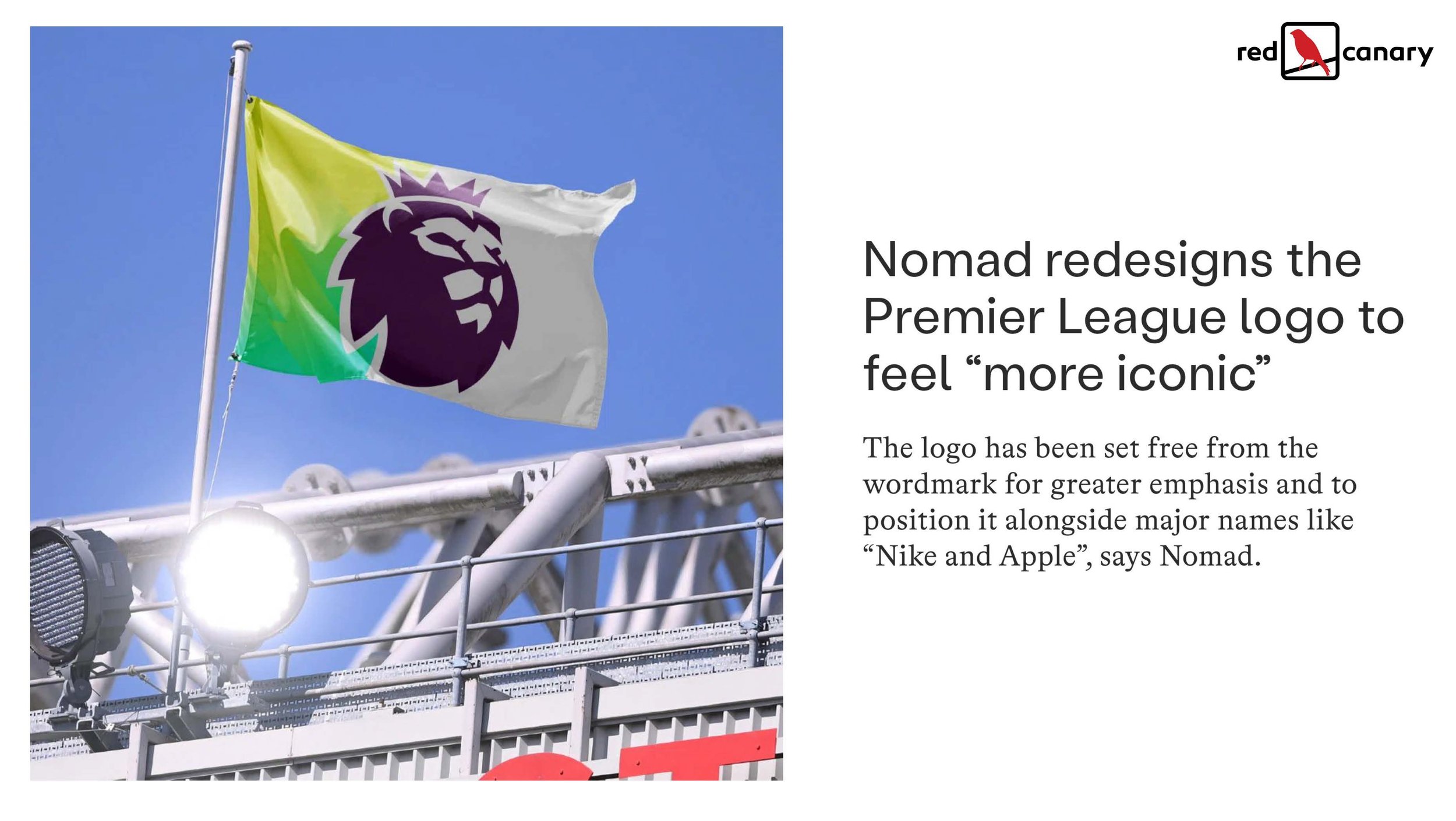
The Premier League redesign was one of the points of inspiration for our project
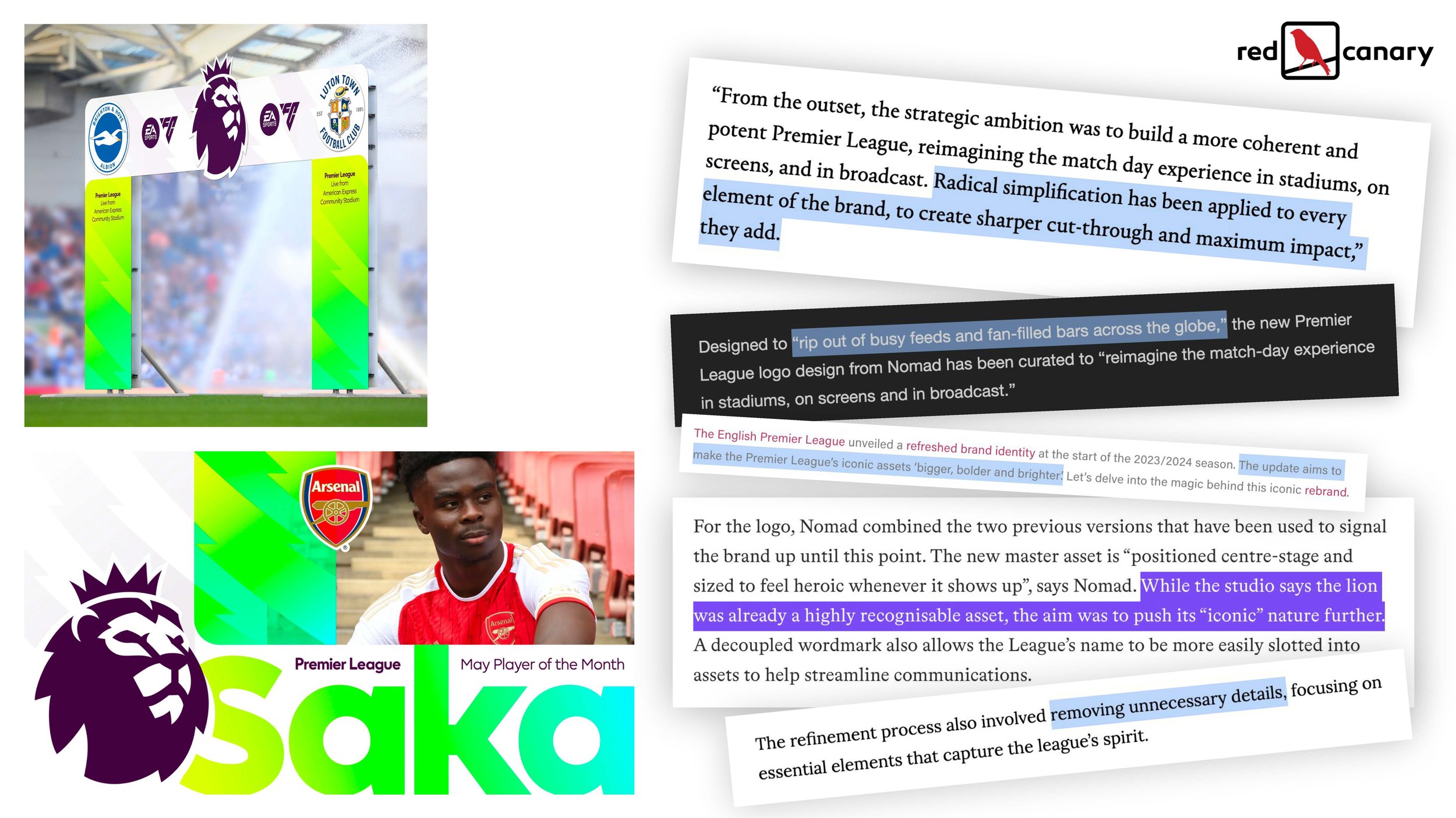
Simplification, move toward the iconic and bold cut-through resonated most
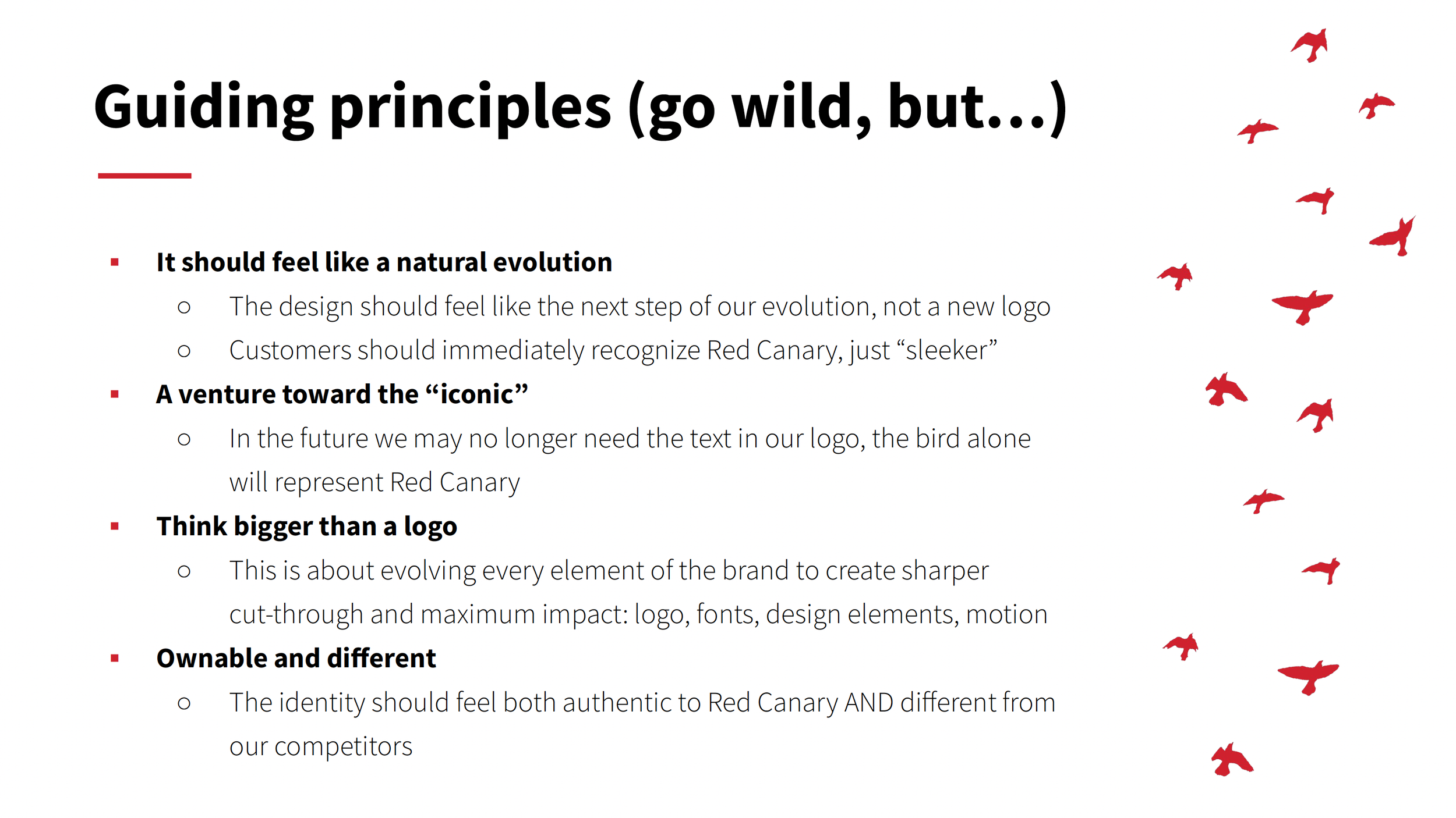
In the beginning we aligned with key stakeholders on these key principles

Over several months the team came together to work through logo iterations
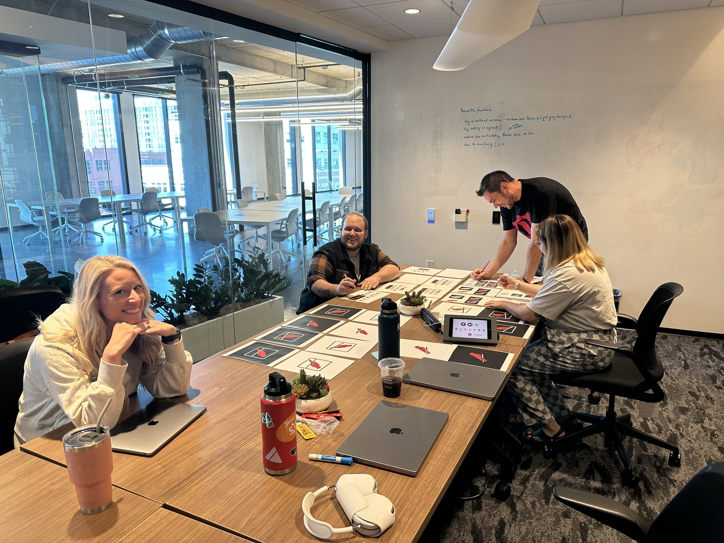

THE THREE LEVELS OF EVOLUTION
With our guiding principles in place, we explored how far the identity could evolve while remaining recognizably Red Canary. Working together, our in-house creative team developed concepts across three levels of change—from a close refinement of the existing logo to a more substantial reimagining.
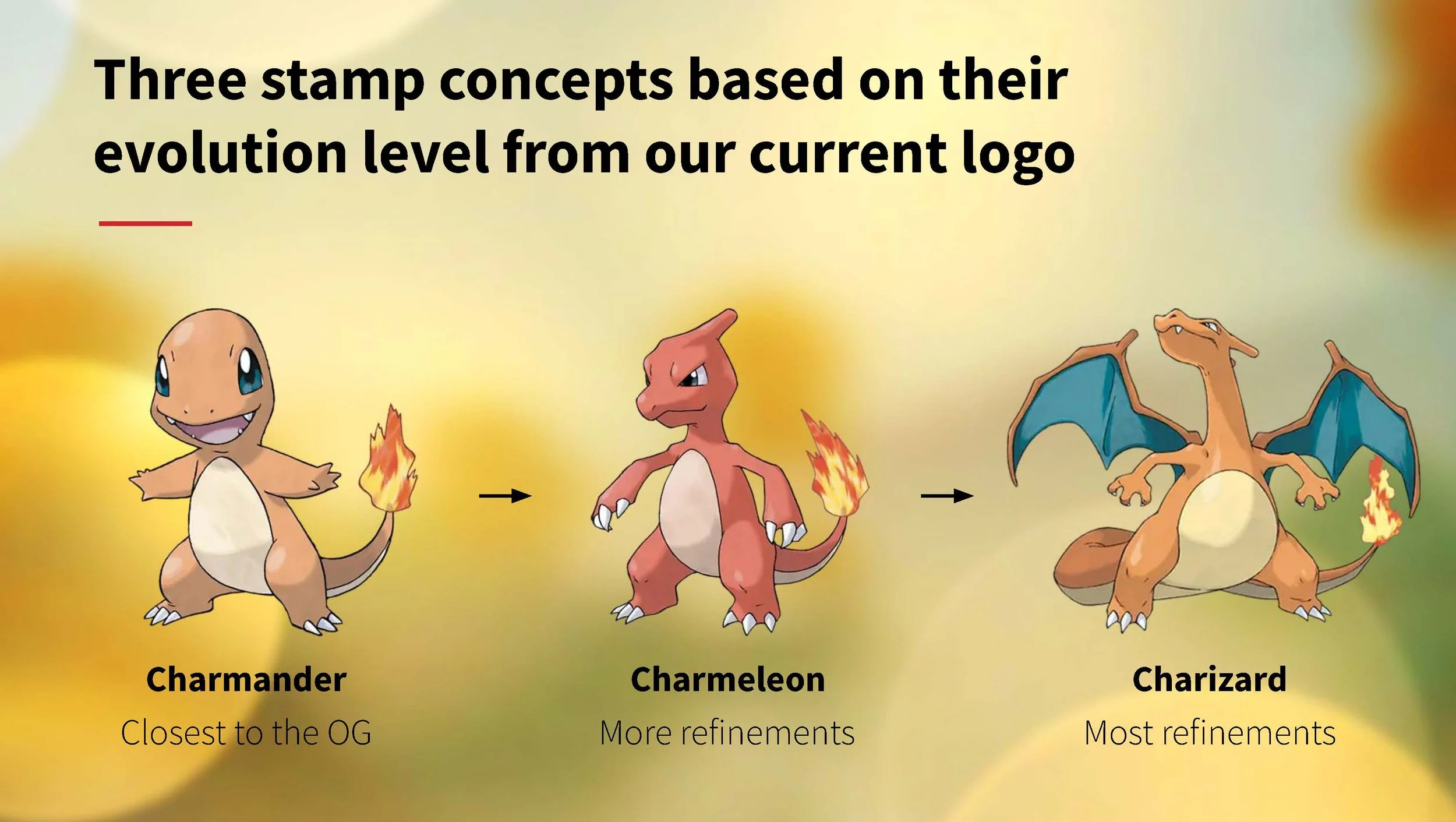
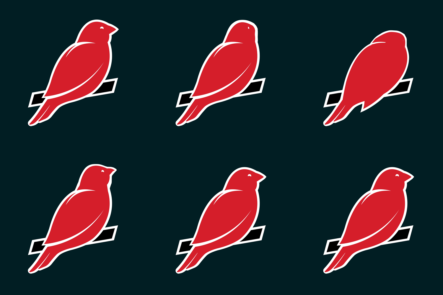
Our in-house team developed concepts across three levels of change
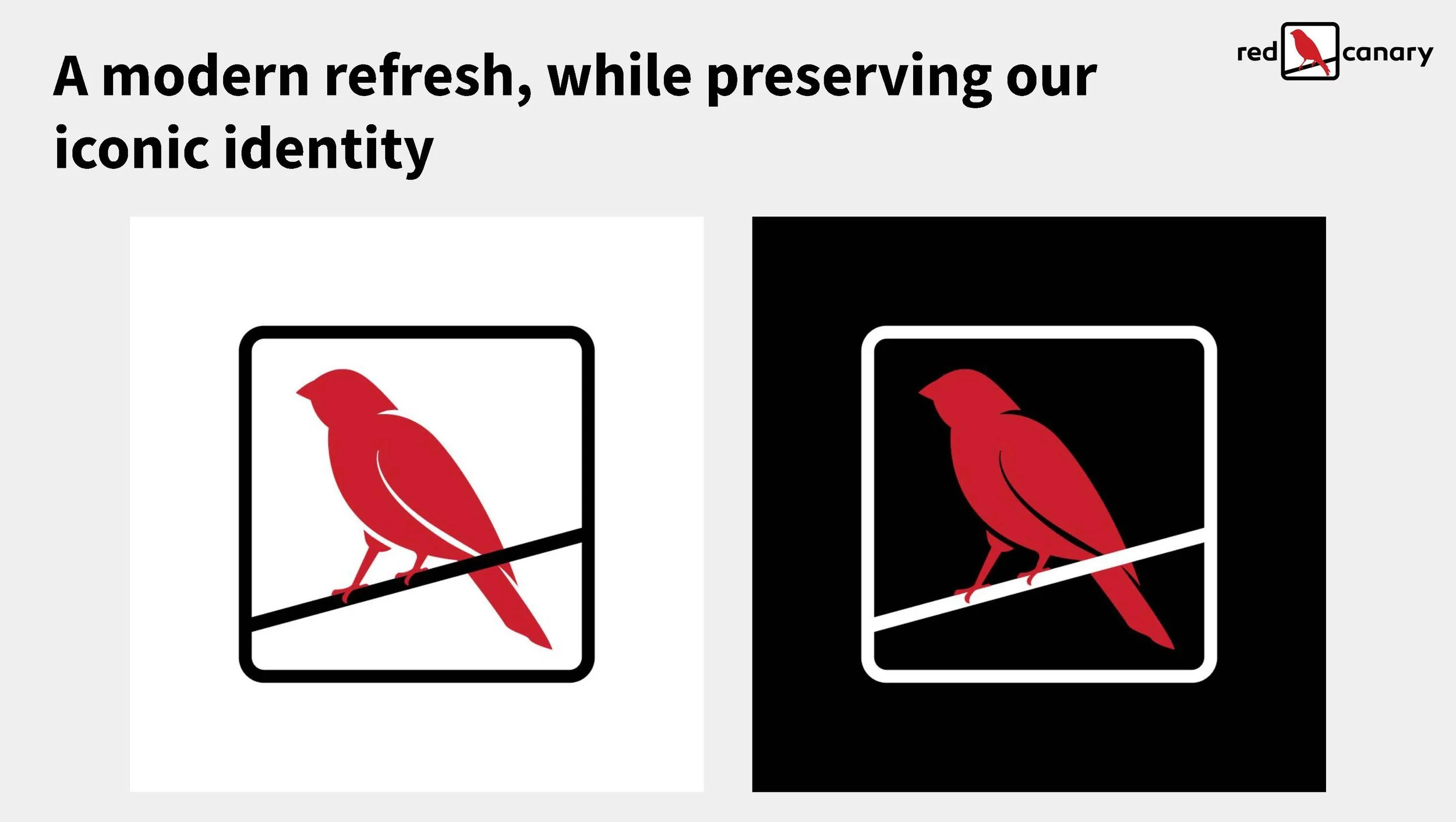
Evolution 1 (Charmander) was closest to the original
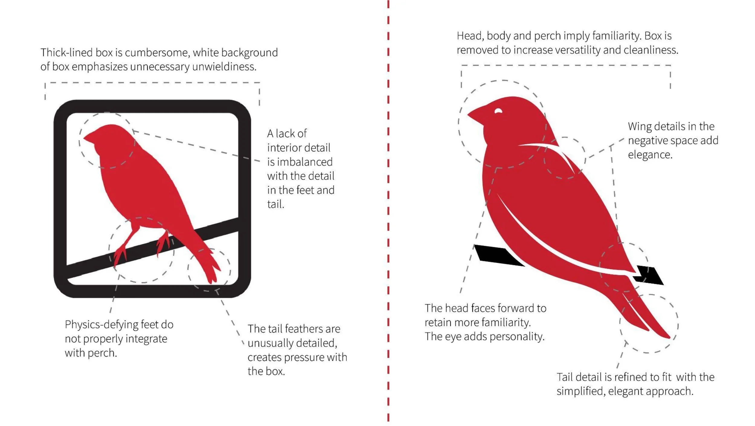
Evolution 2 (Charmeleon) featured more refinements
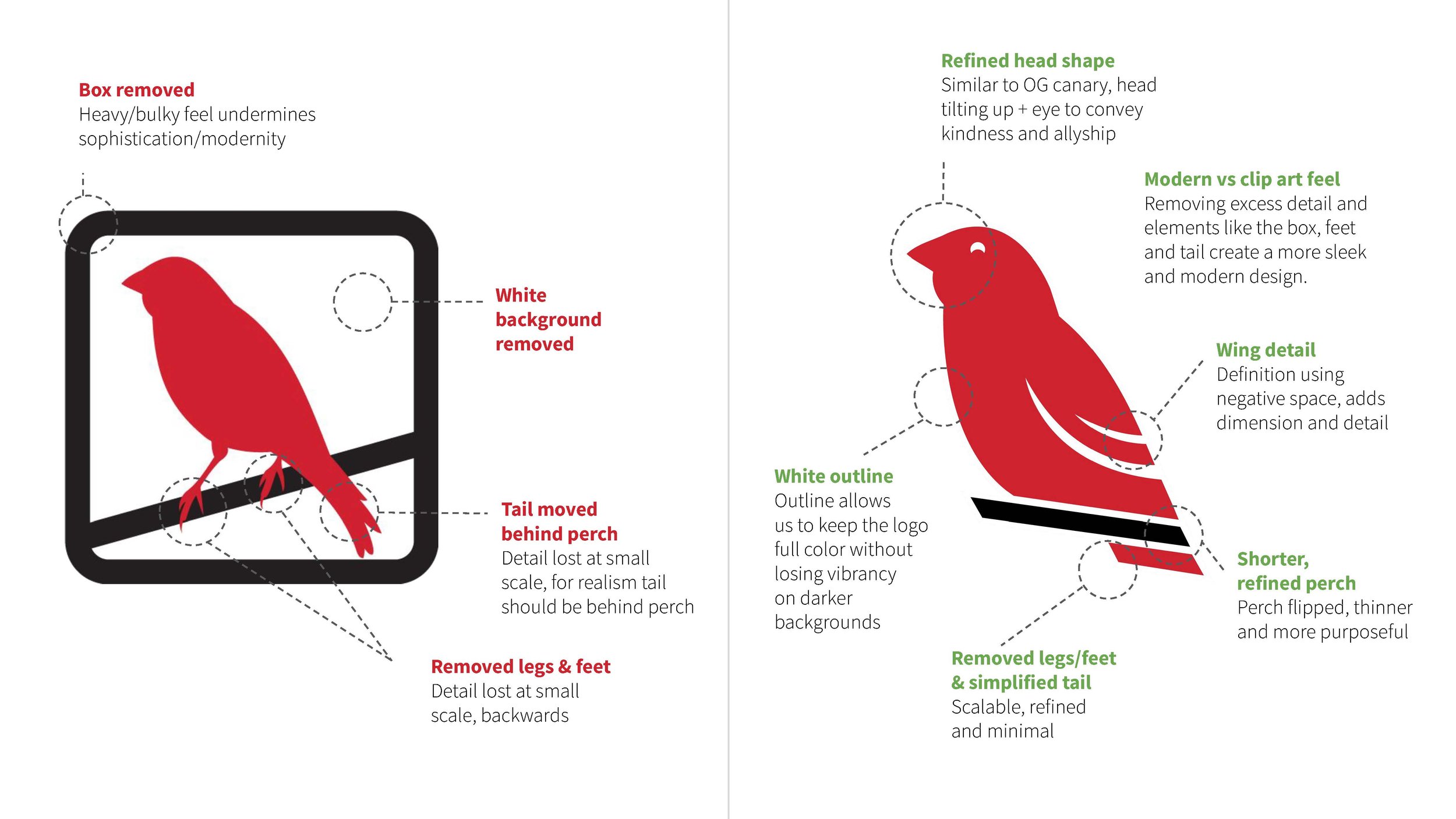
Evolution 3 featured the most substantial reimagining
THE FINAL LOGO DECISION
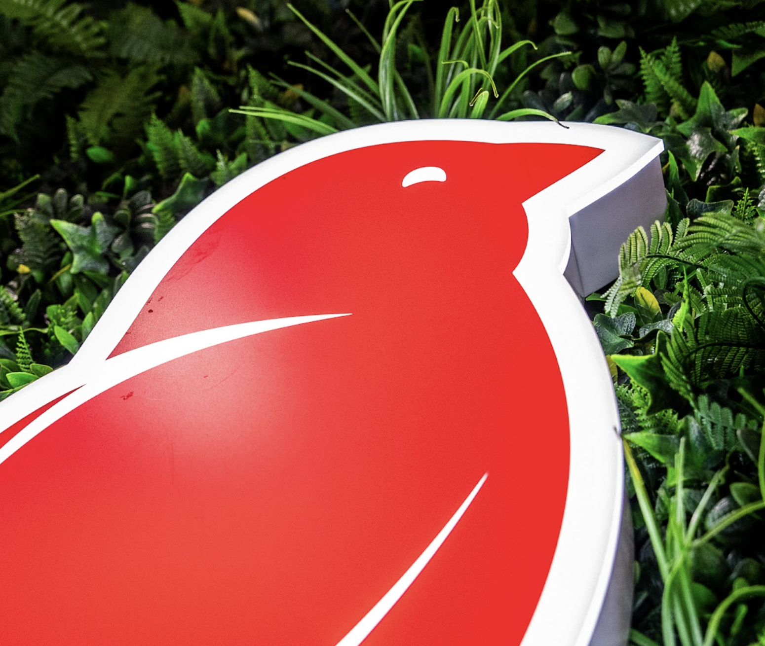
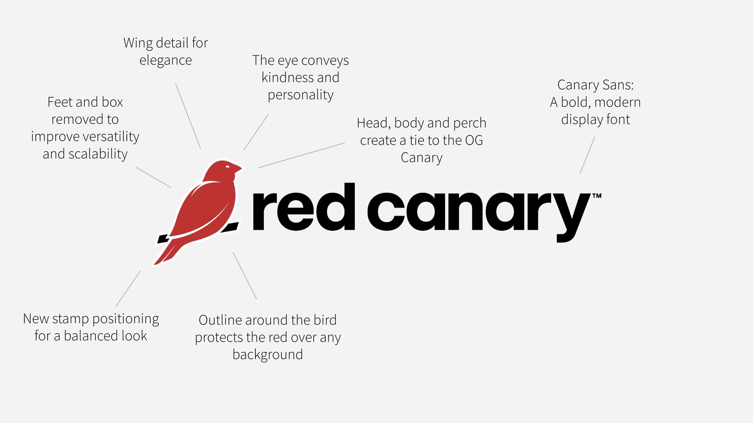
To make the final decision we came back to our guiding principles. Evolution #2 felt like a more modern expression with a clear connection to the original canary. It gave us the strongest balance of familiarity and simplification, preserving the canary’s character while removing the elements that limited its flexibility.
DEVELOPING IDENTITY “BEYOND THE LOGO”
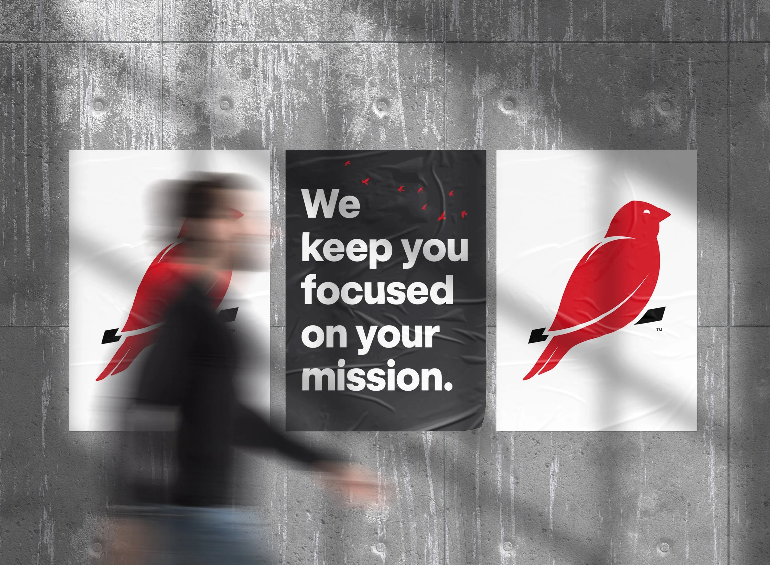
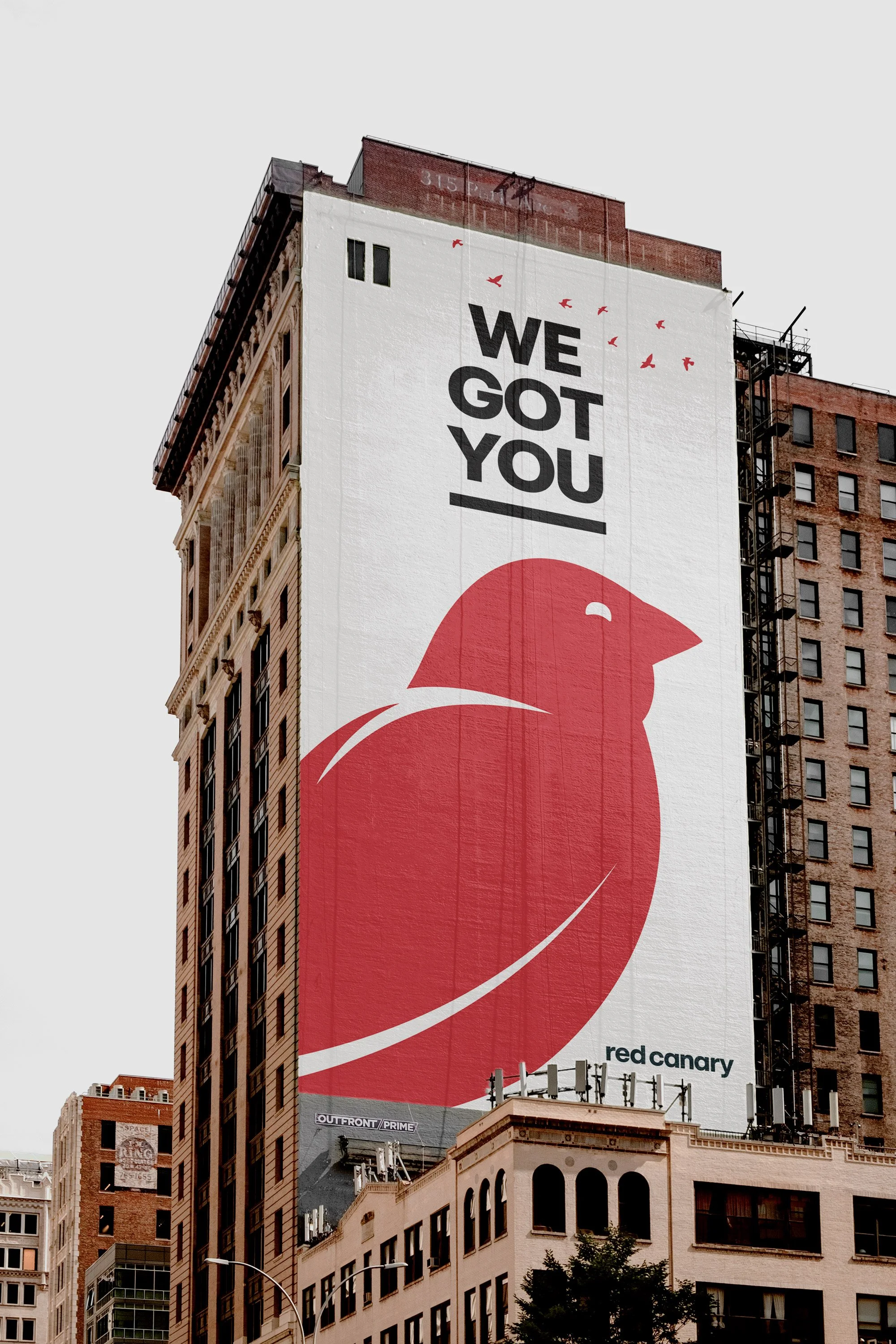
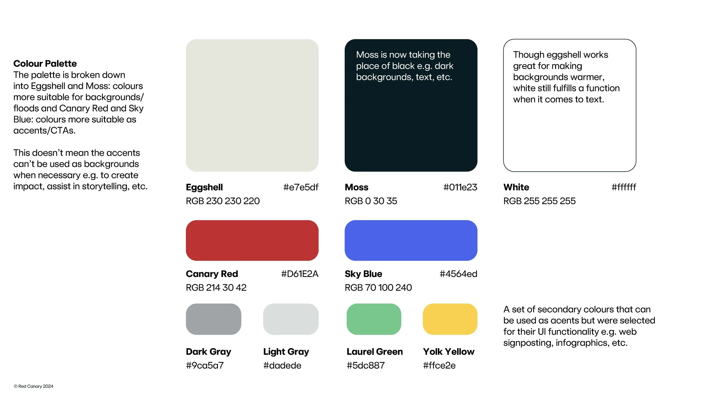
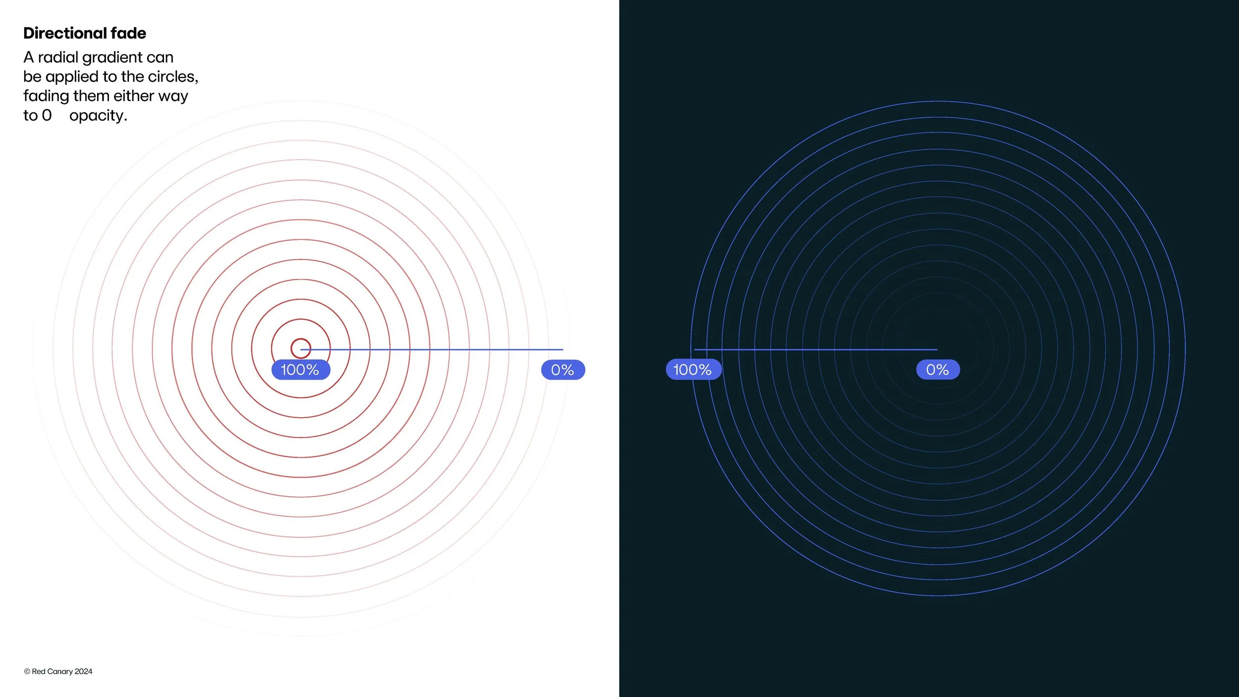
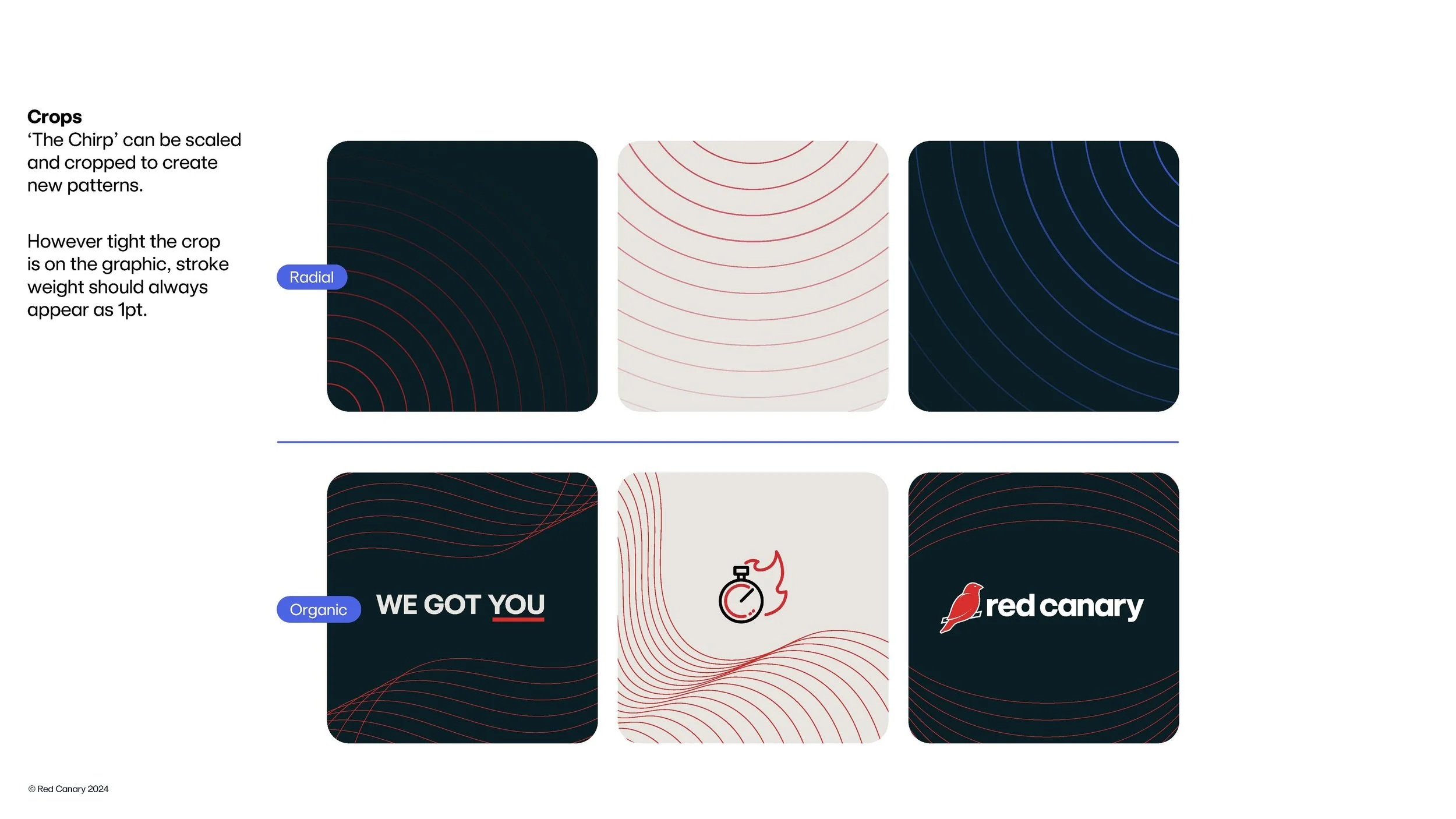
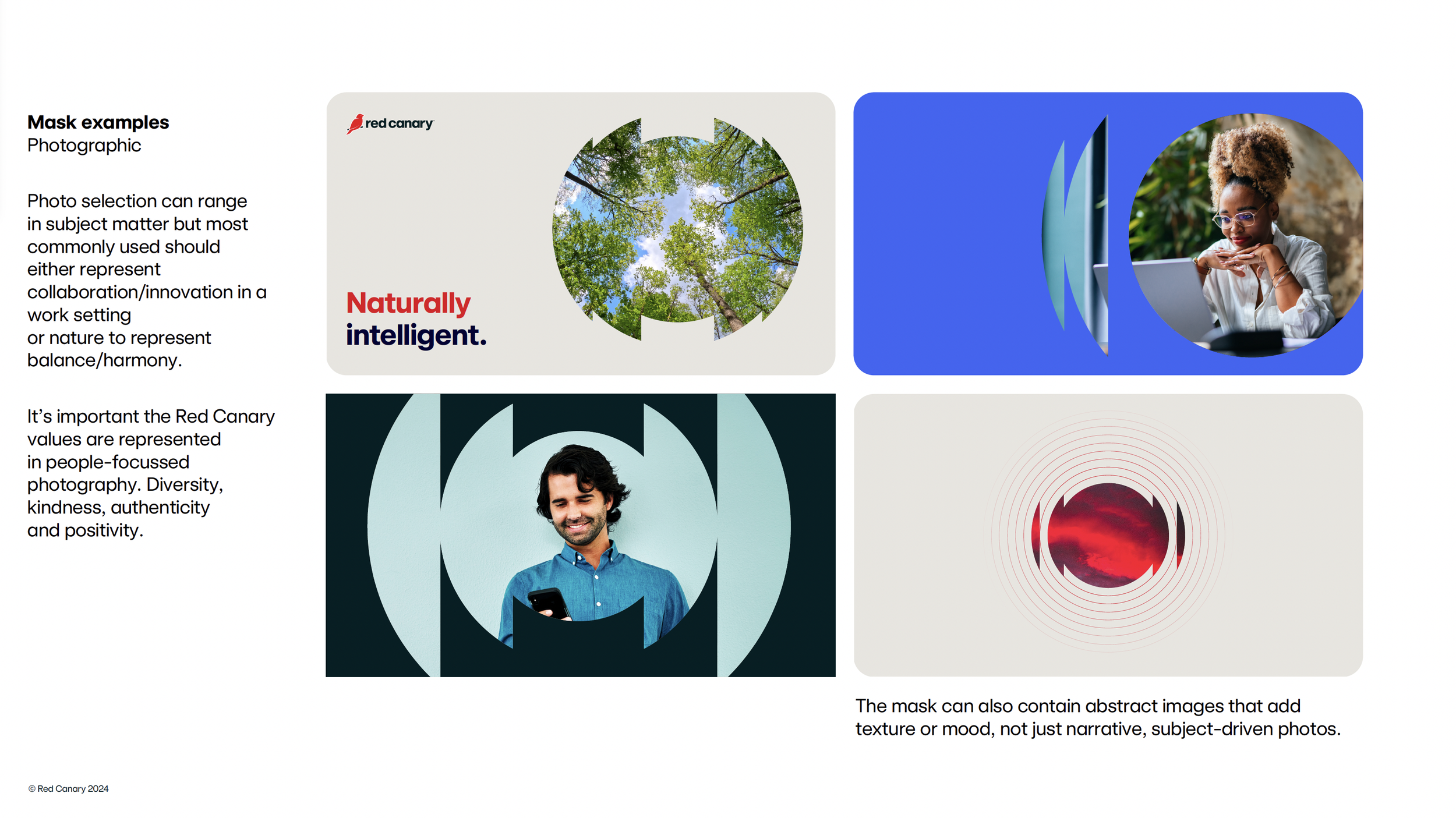
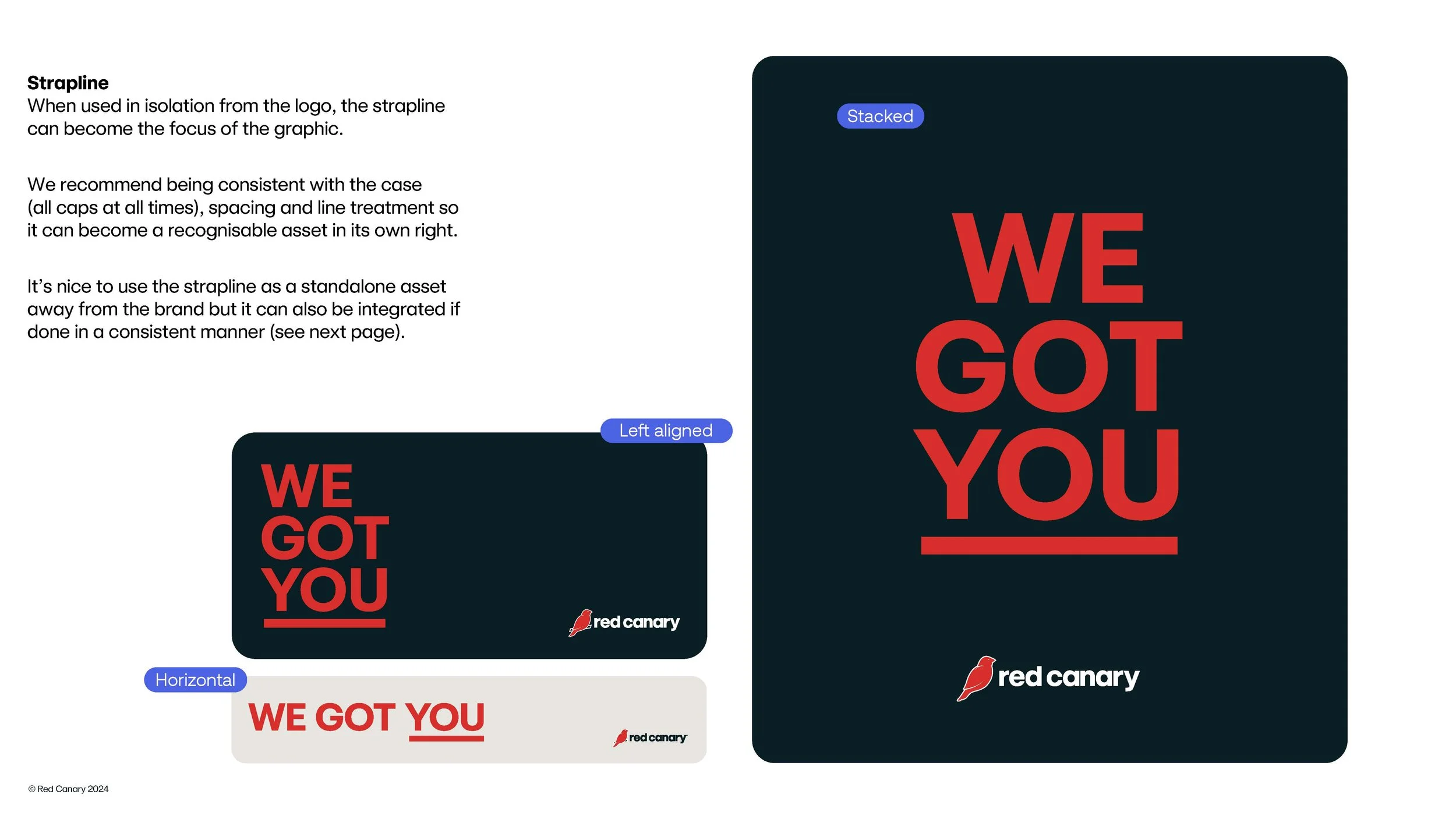
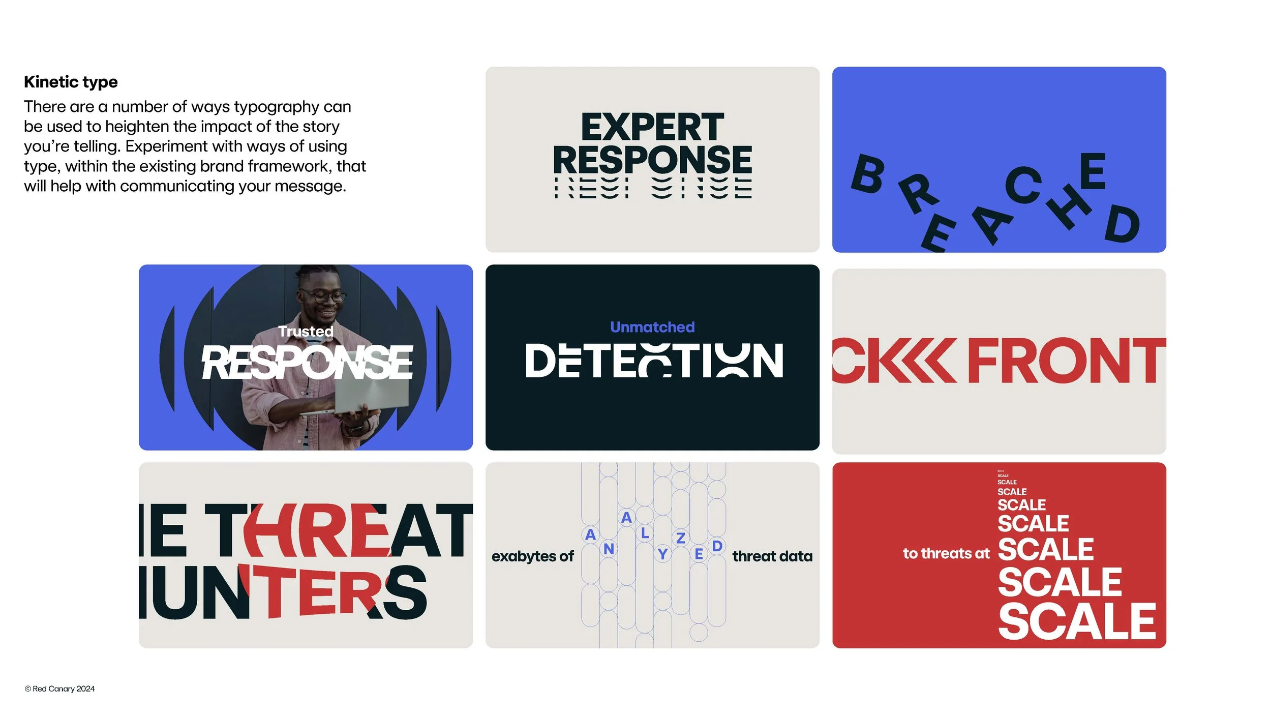
To deliver on our principle of “think bigger than a logo,” we partnered with Shaped By to expand the refresh into a complete visual identity. Together, we explored directions for color, graphics, and expressive typography, developing elements like the Chirp to give Red Canary a distinctive, flexible visual language—all brought together in new brand guidelines.
THE REVEAL AND THE RESPONSE
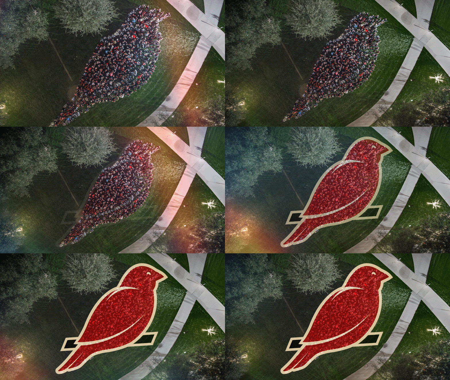
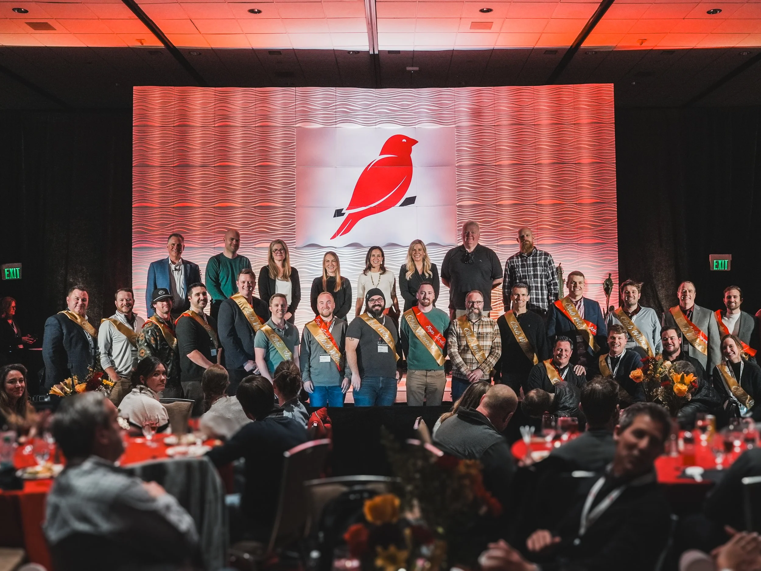
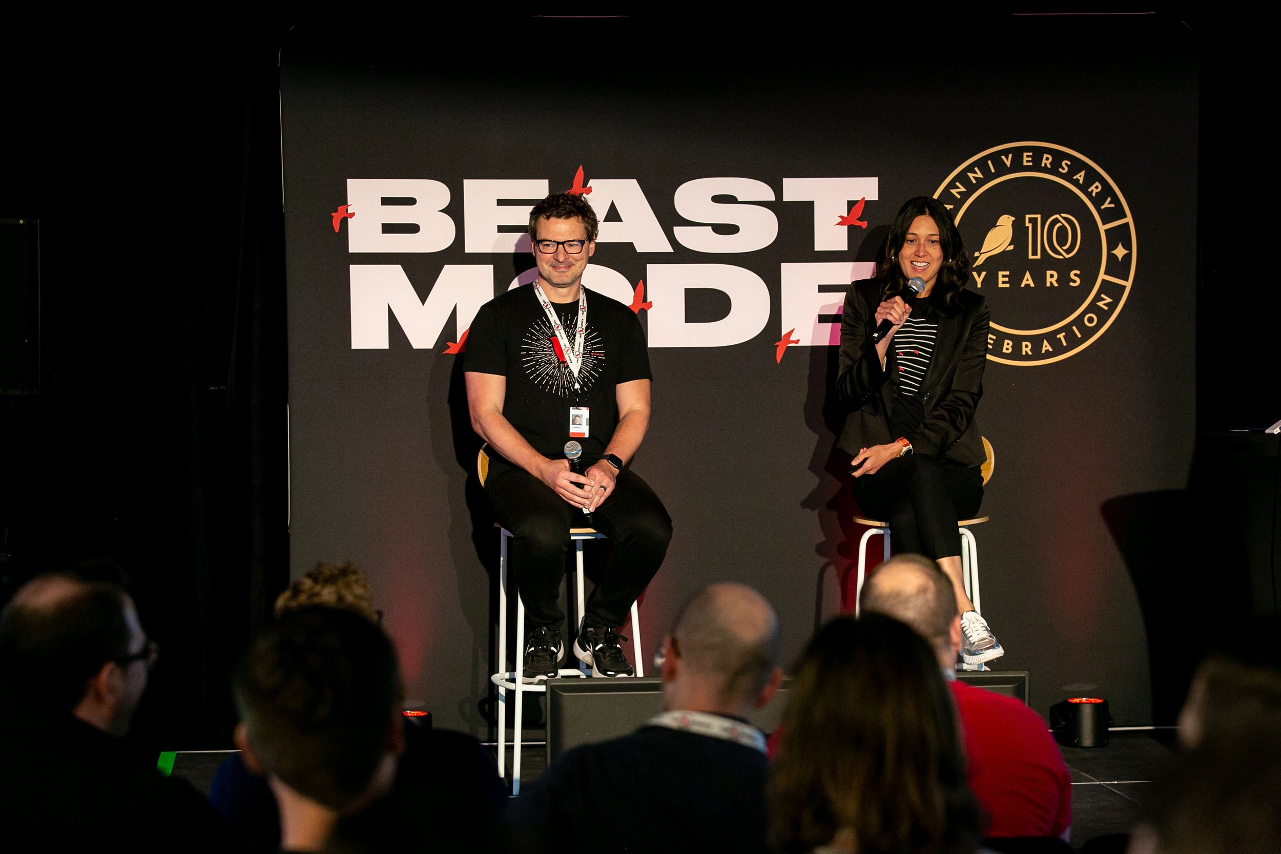
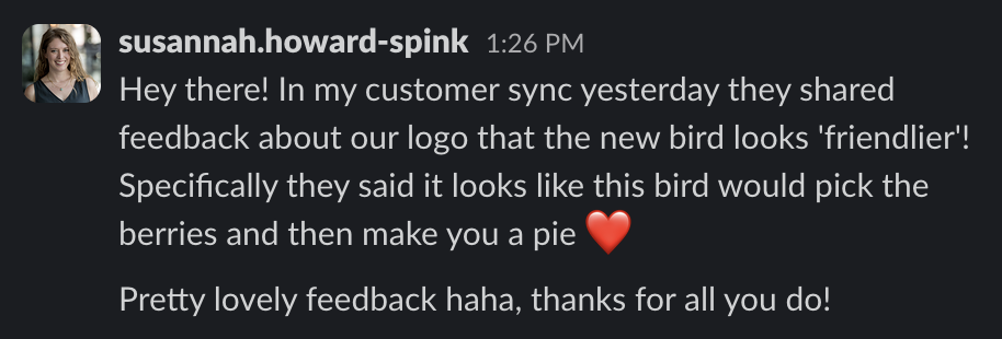
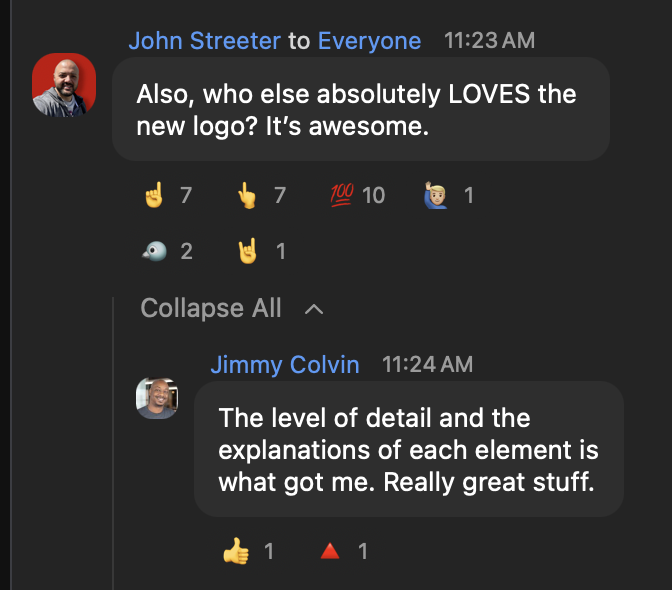
Standing on stage with Melissa (our CMO) to reveal the new identity was one of my proudest moments at Red Canary. After months of collaboration and refinement, feeling the energy in the room and seeing how much people loved it was deeply rewarding. The excitement gave the launch momentum, bringing Canaries together around a brand they felt proud to represent.
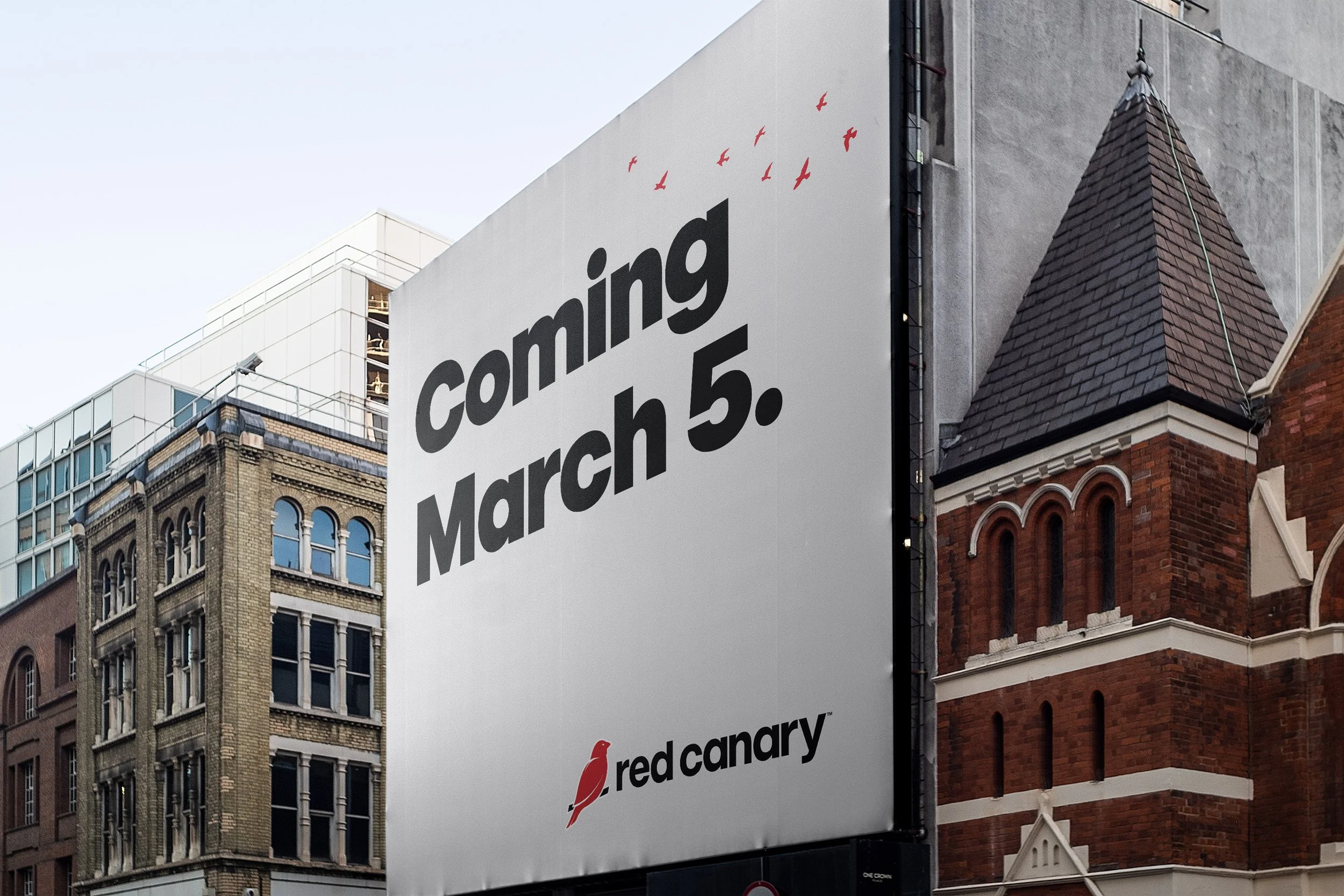
The refreshed identity launched in March 2024. Red Canary was later acquired by Zscaler in August 2025.

THE LAUNCH VIDEO
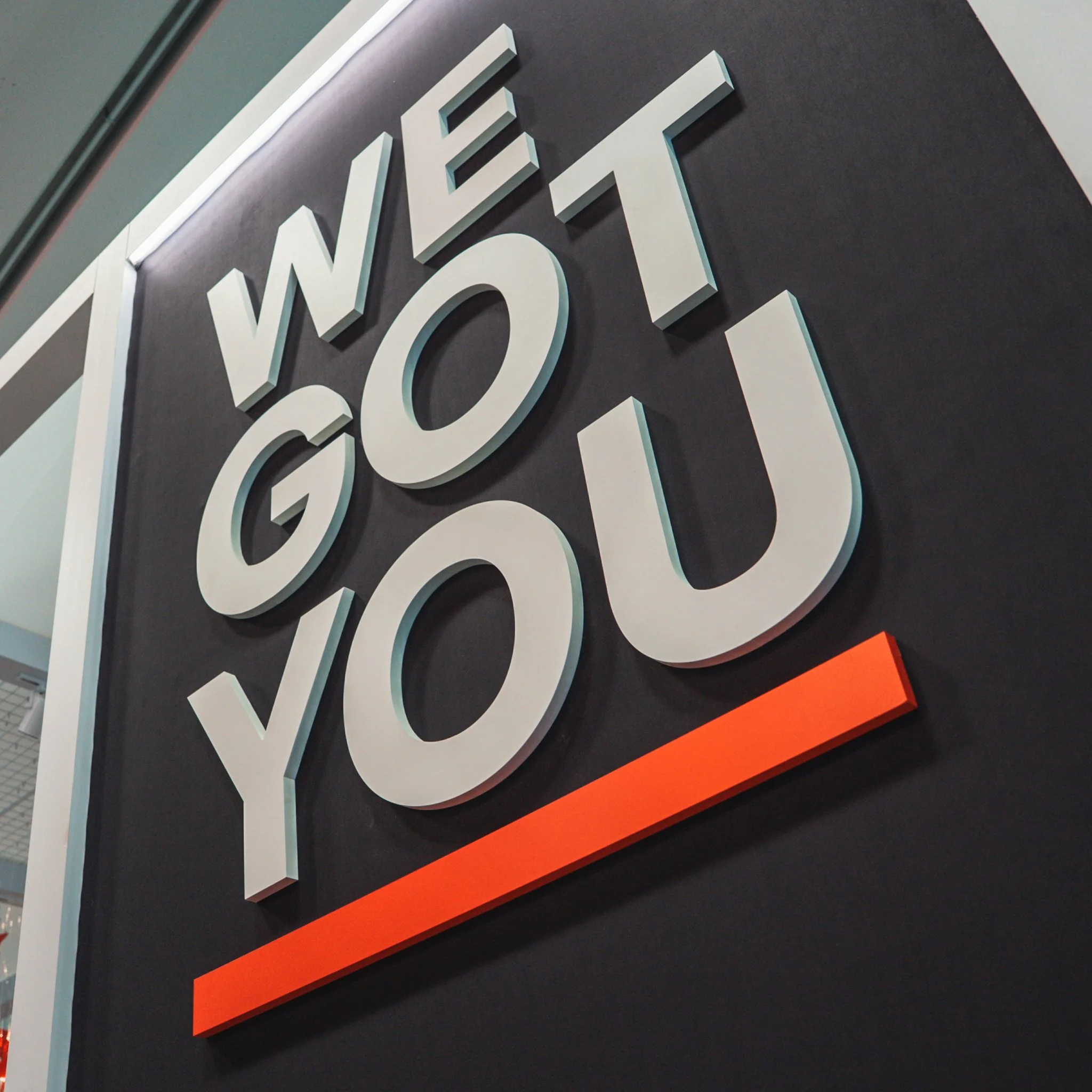
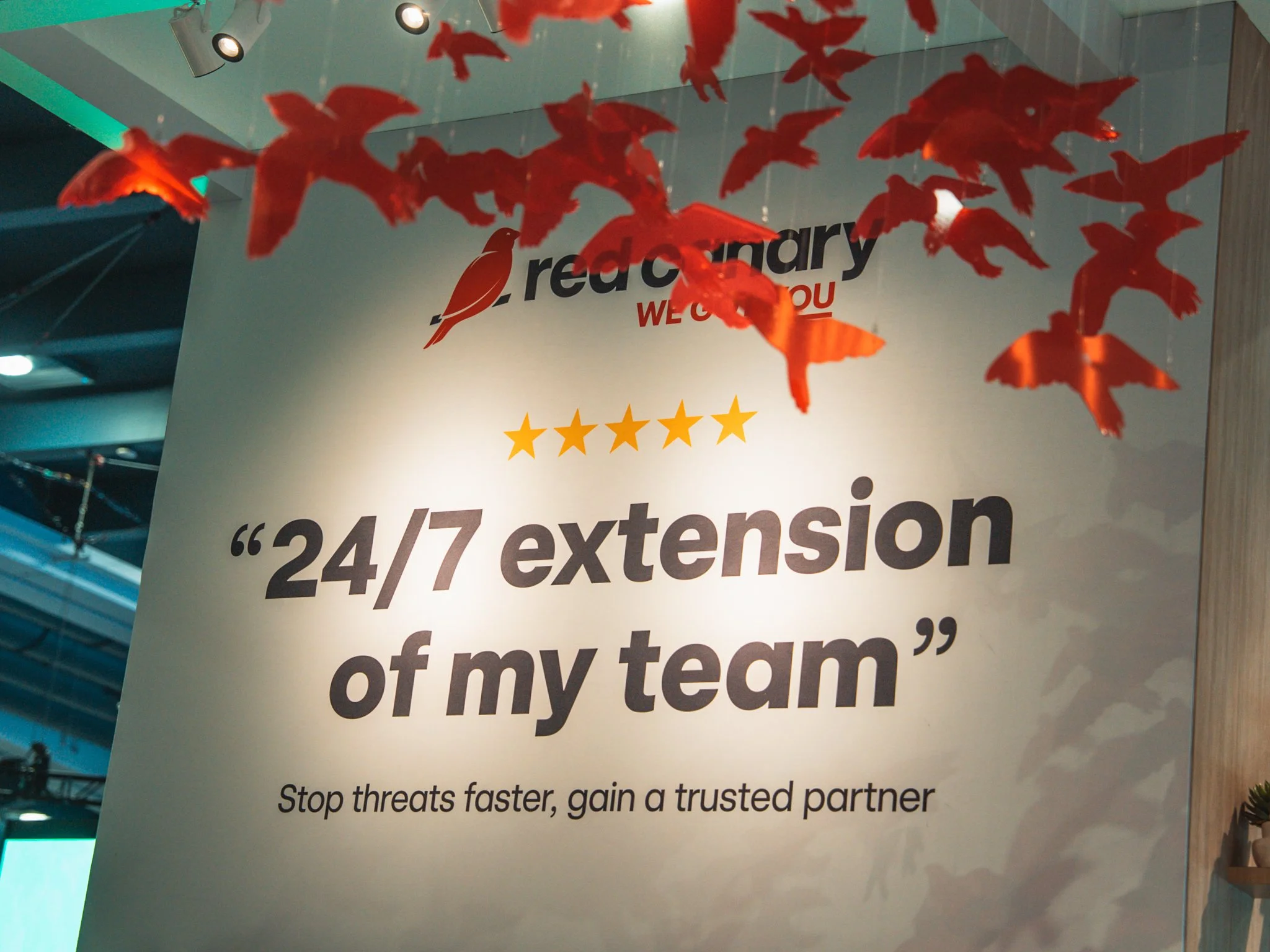
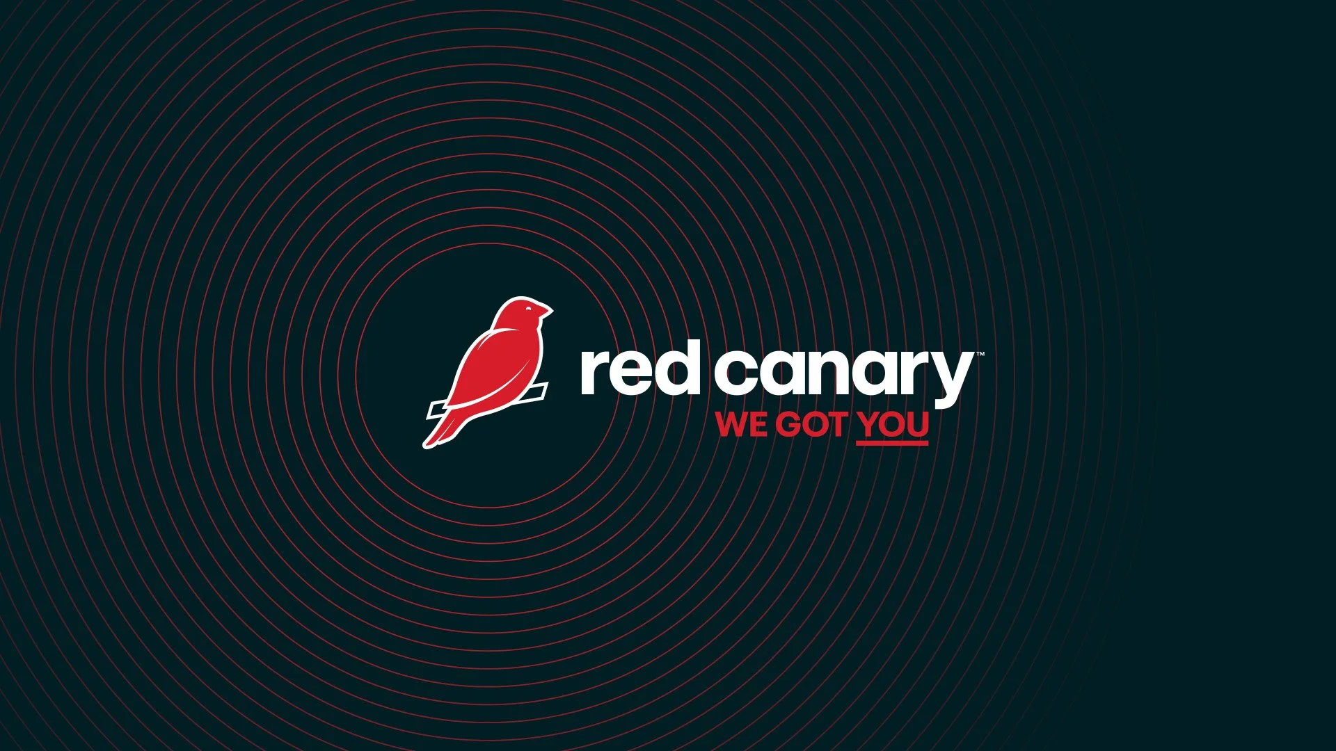
The launch film introduced our refreshed identity and new messaging: ‘WE GOT YOU.’
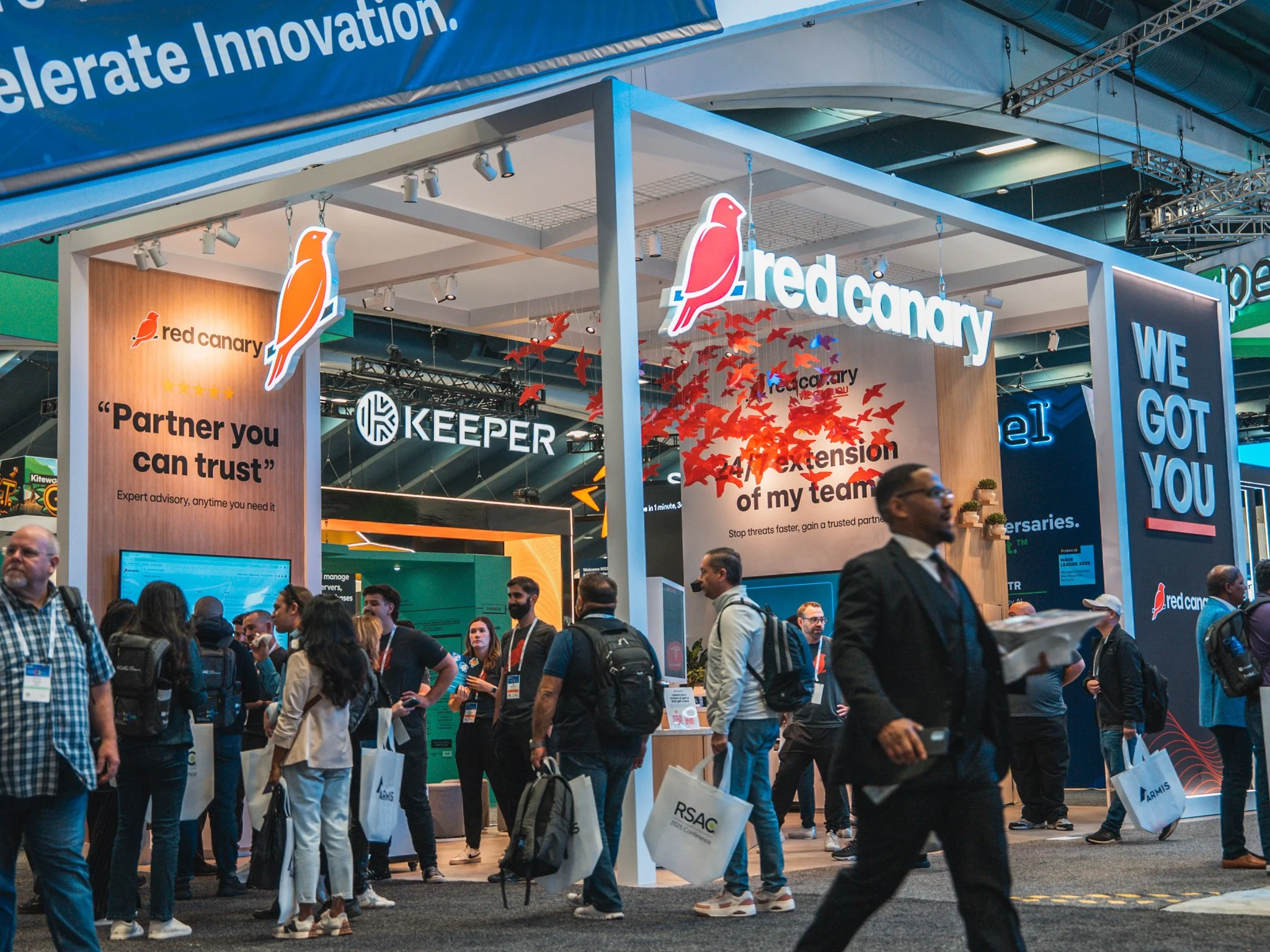
Bringing it all to life