Zscaler Creative Direction
CREATIVE DIRECTION ACROSS GLOBAL EVENTS
As Creative Director, I guided work across a global team of 20+ creatives and agency partners. My role spanned translating stakeholder input into creative direction, developing concepts with designers, and maintaining consistency through production and live execution.
Zenith Live
CARRYING THE CREATIVE VISION ACROSS TWO GLOBAL EVENTS
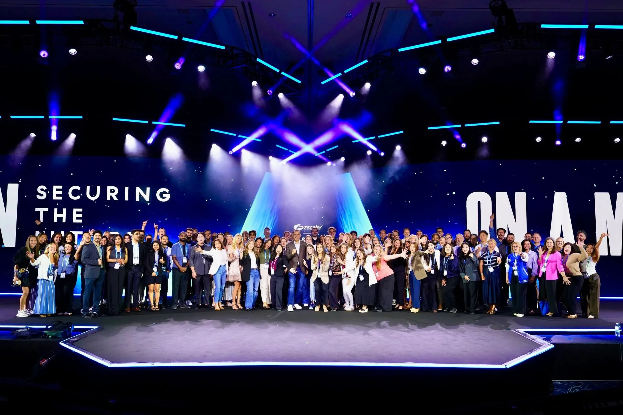
I joined with detailed event guidelines in place, but production revealed gaps and room for interpretation. I brought designs back to the core blue and green palette when accent colors became too dominant, partnered with the video team to establish motion guidance, and clarified the brief as new applications emerged.
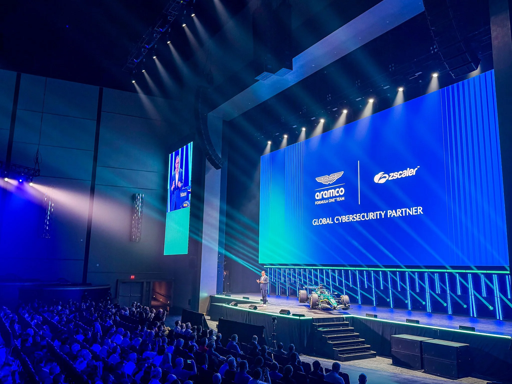
Across Las Vegas and Vienna, I reviewed hundreds of Taylor Group design and motion files covering stage design, LED screens, and signage. I led event tee development through multiple print proofs to resolve gradient quality issues and attended every cue-to-cue rehearsal at both events. For the Aston Martin F1 sponsorship reveal, I contributed feedback on the logo lockup, screen graphics, and audio, video, and lighting sequence to give the moment greater impact.
Key contributors: Taylor Group and Zscaler in-house creative team
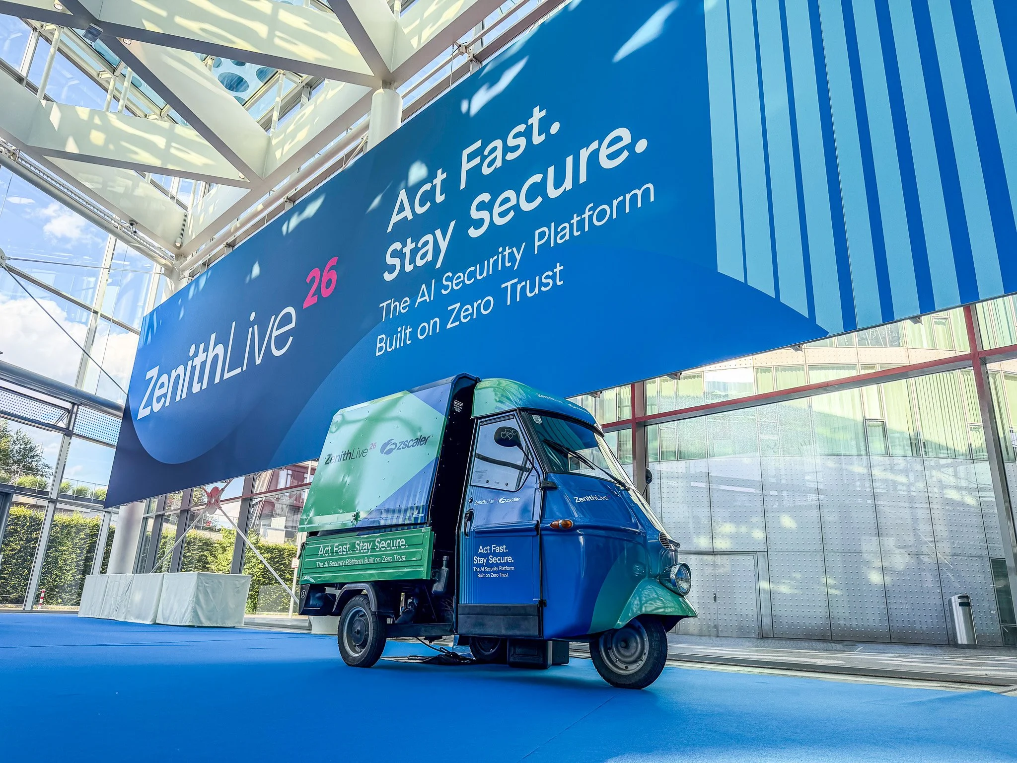
Environmental branding and signage review
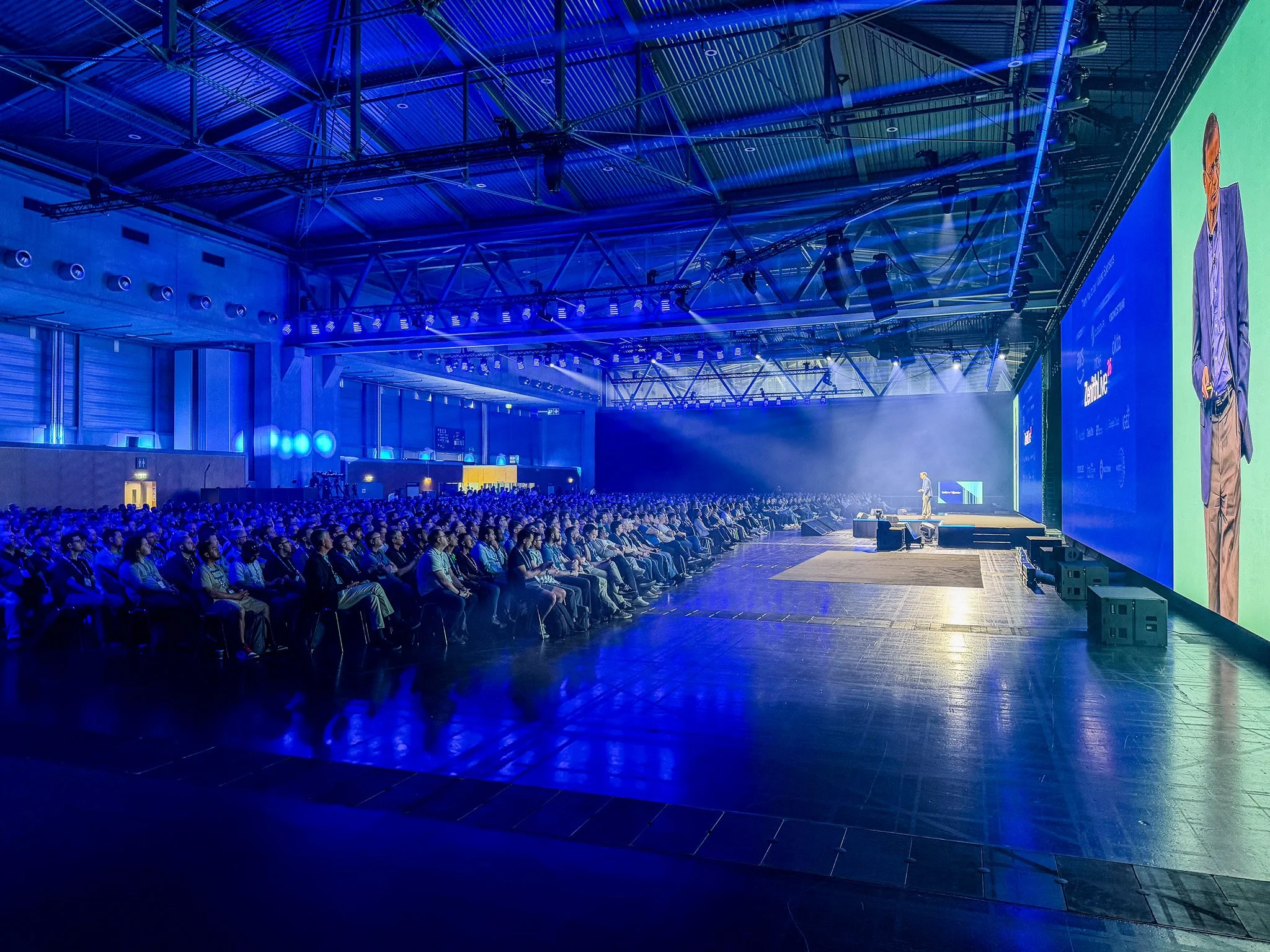
Presentation feedback during cue-to-cue rehearsals
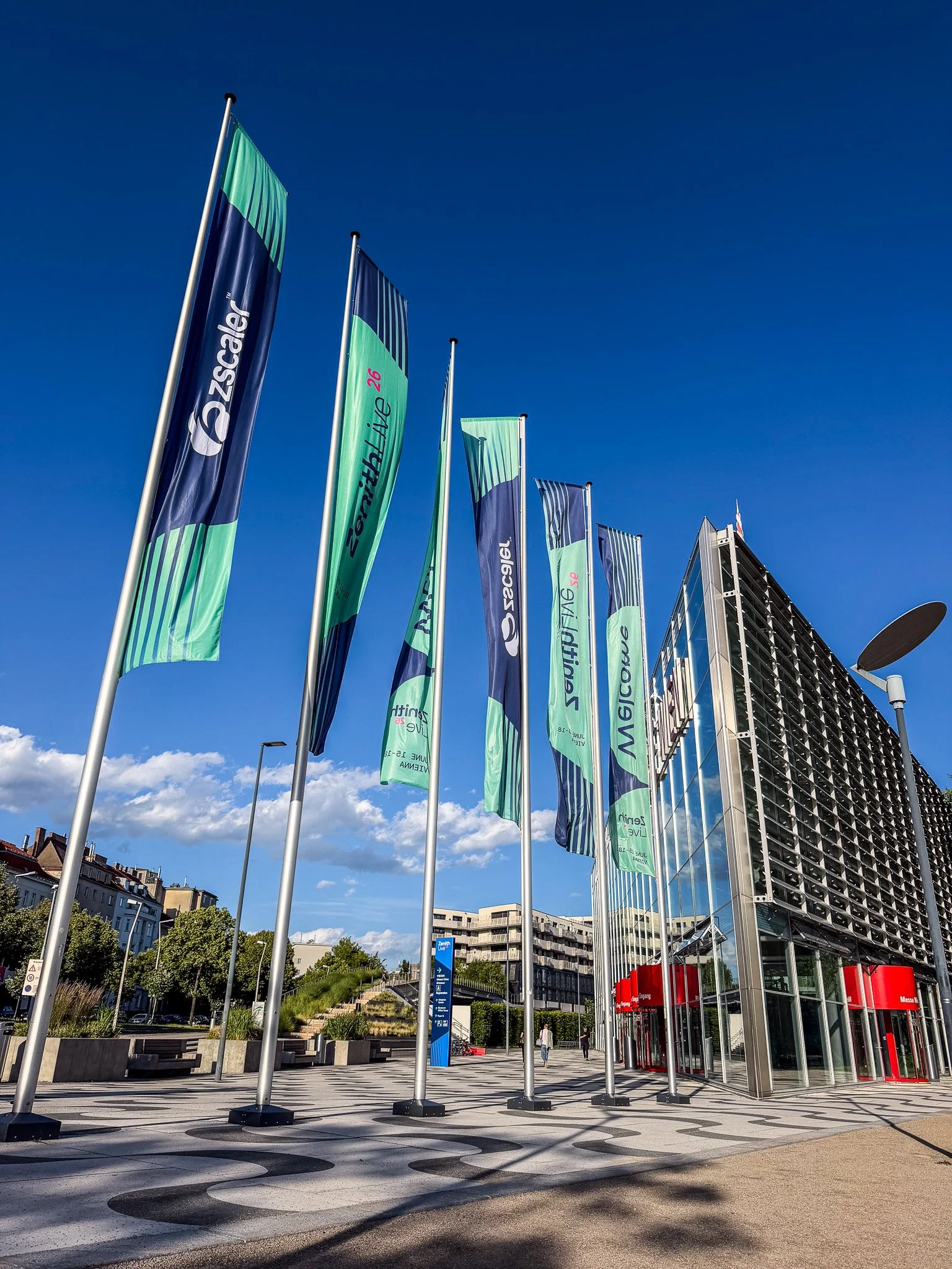
Brand consistency across outdoor signage
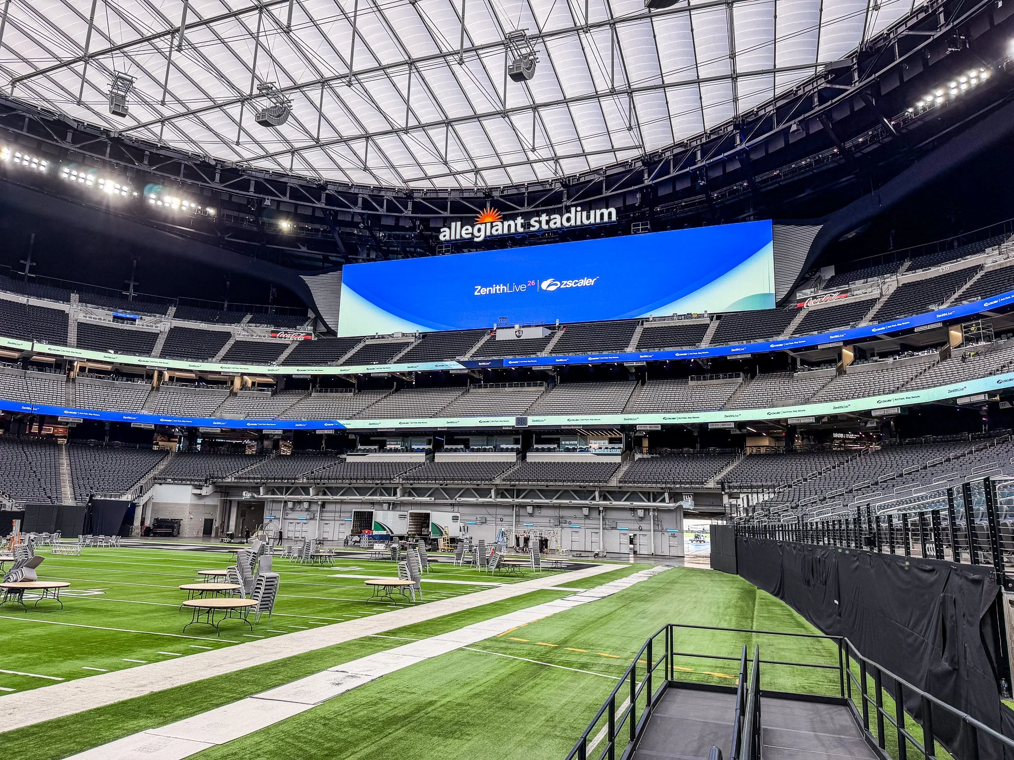
Motion guidance developed with the video team
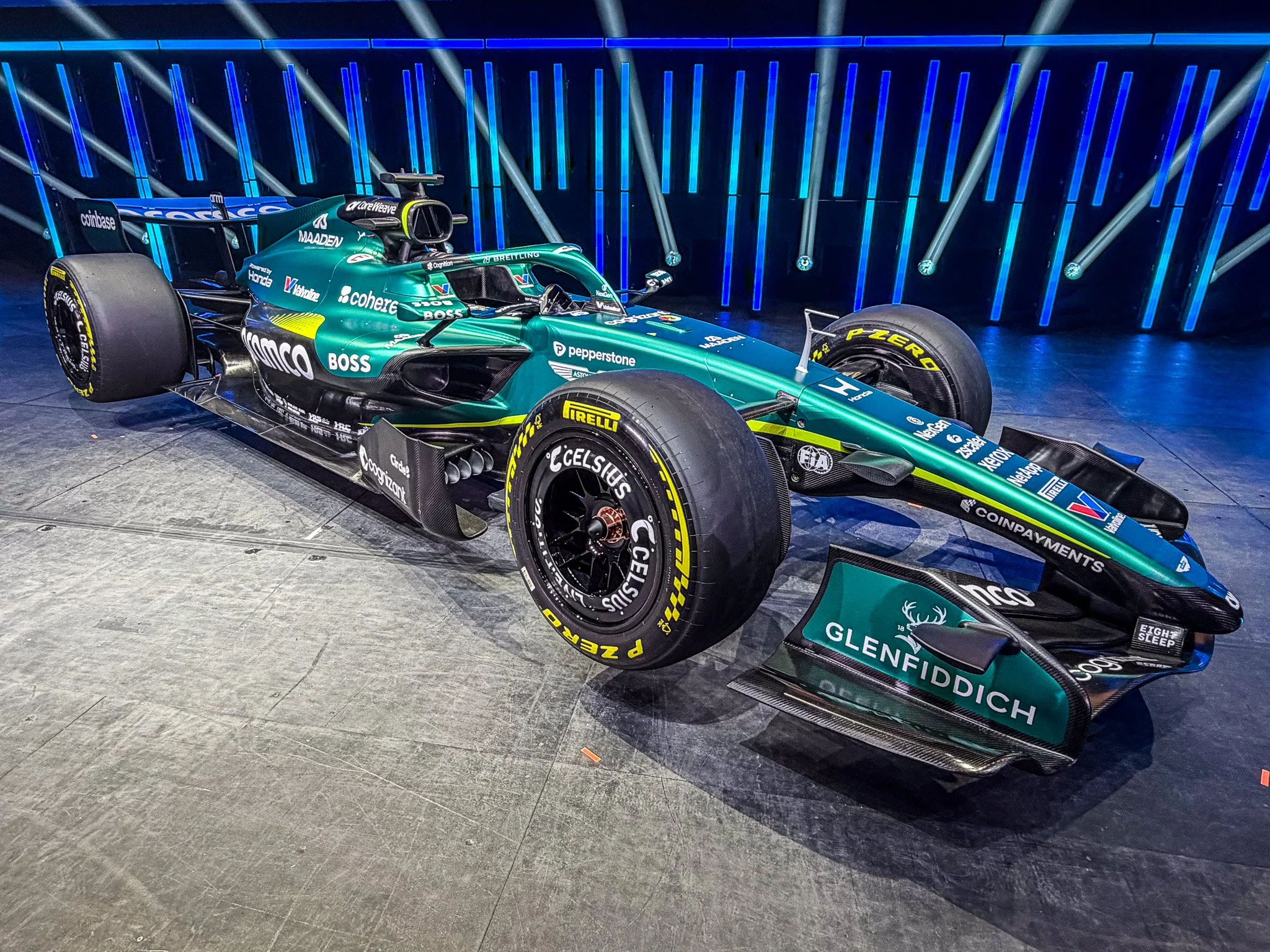
Creative input on the Aston Martin F1 reveal
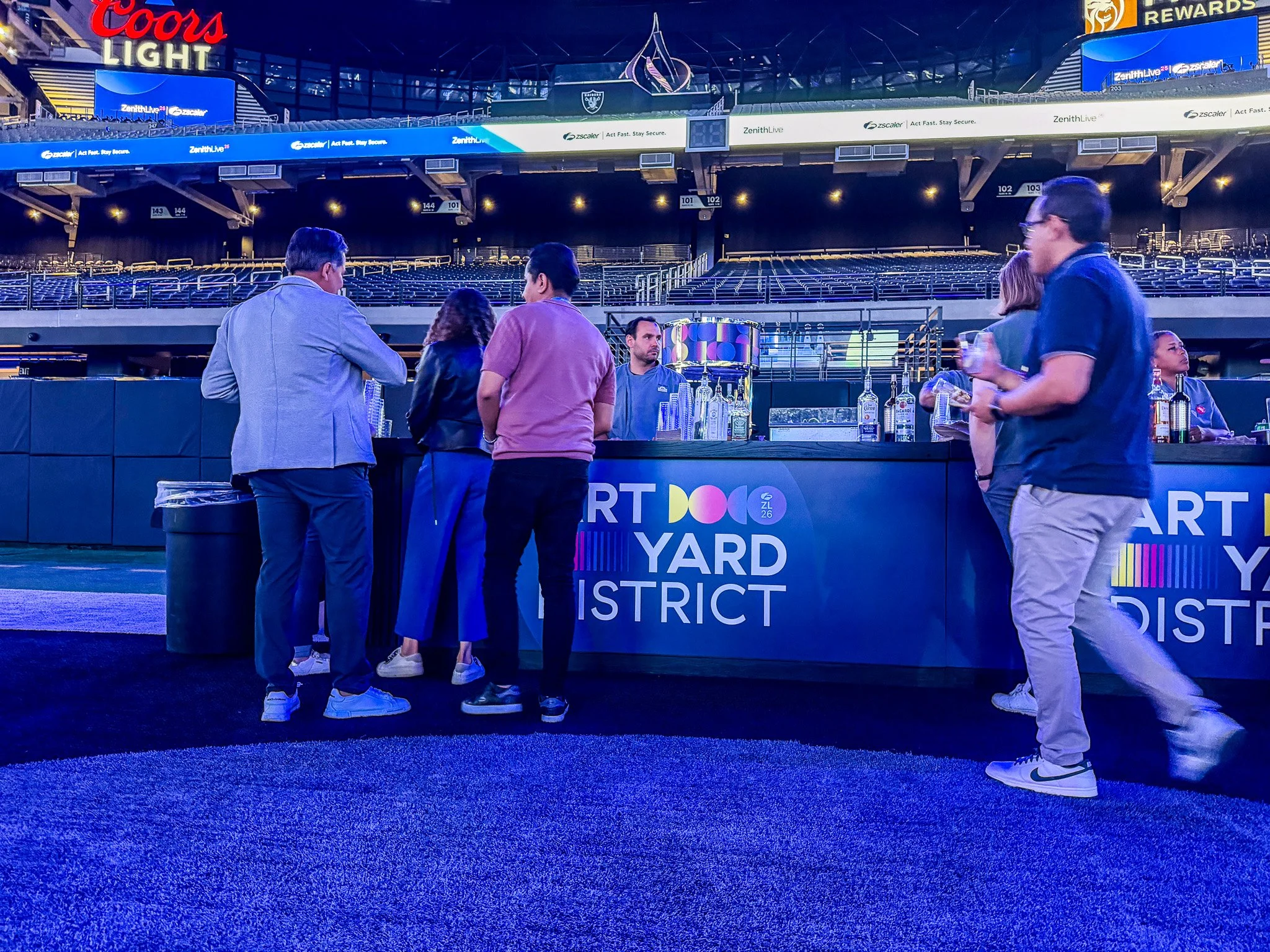
Art Yard district theme design
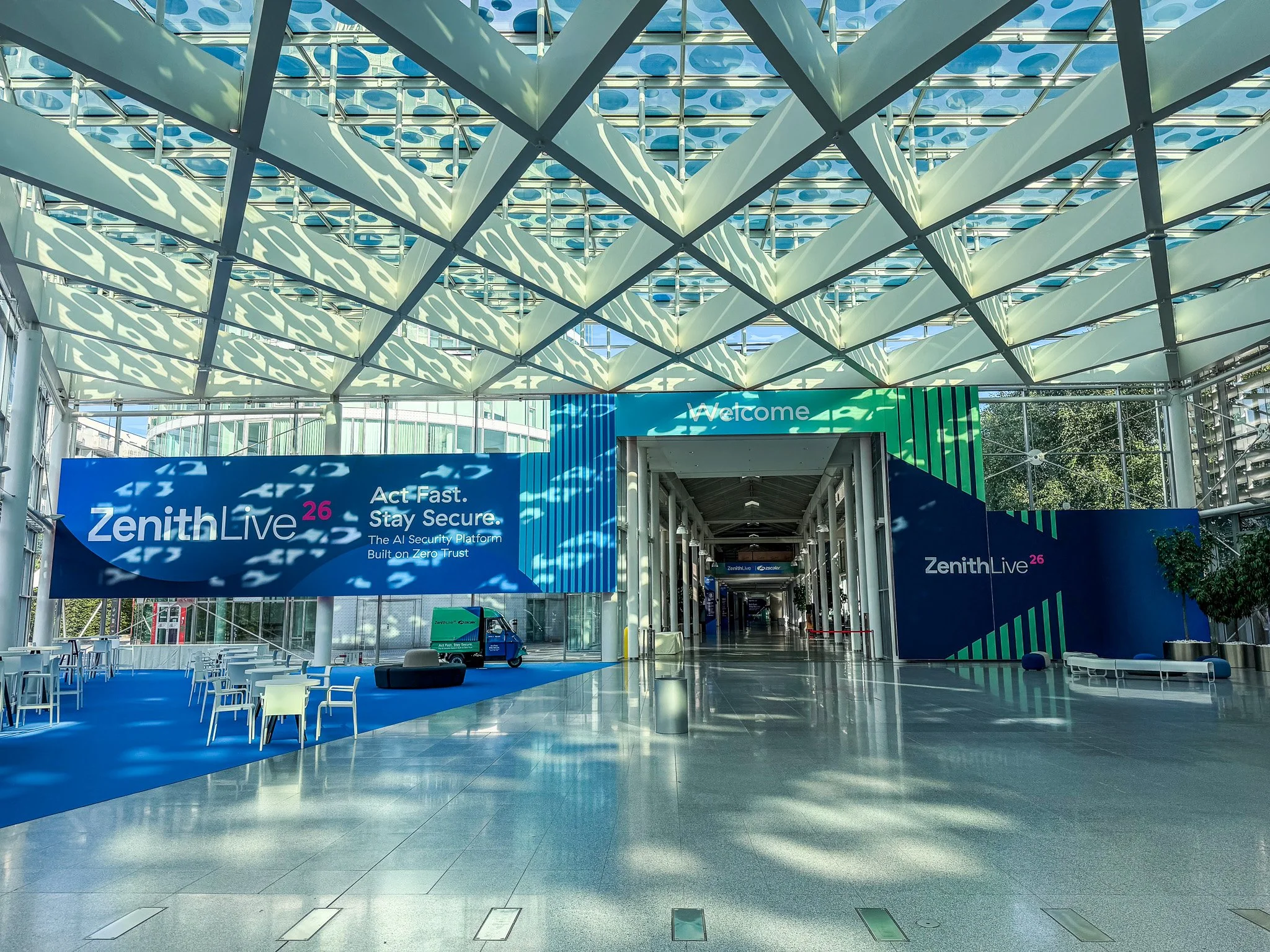
Brand consistency across the event environment
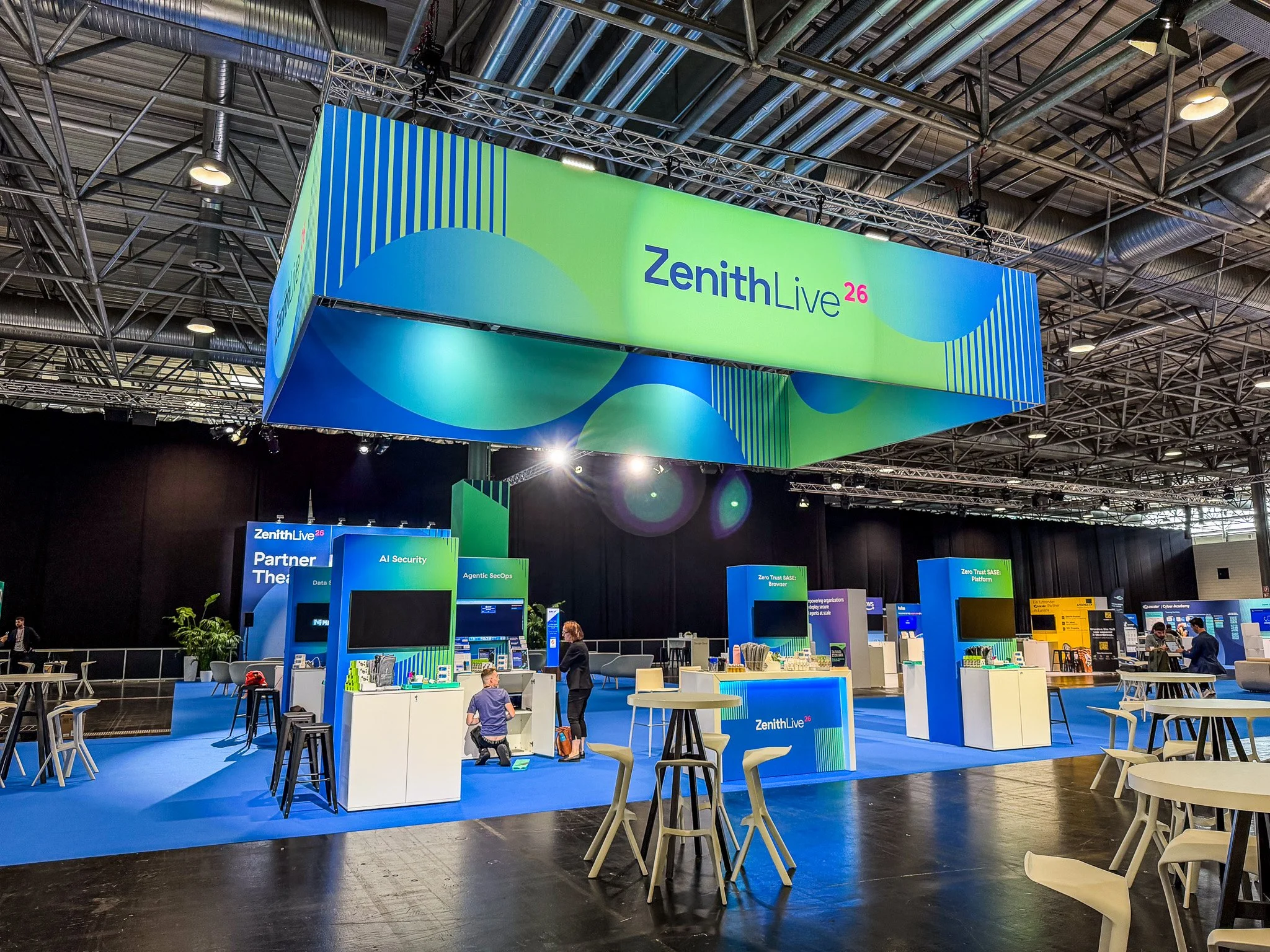
Expo signage and graphics review
Investor Day
GIVING THE CONTENT ROOM TO LEAD
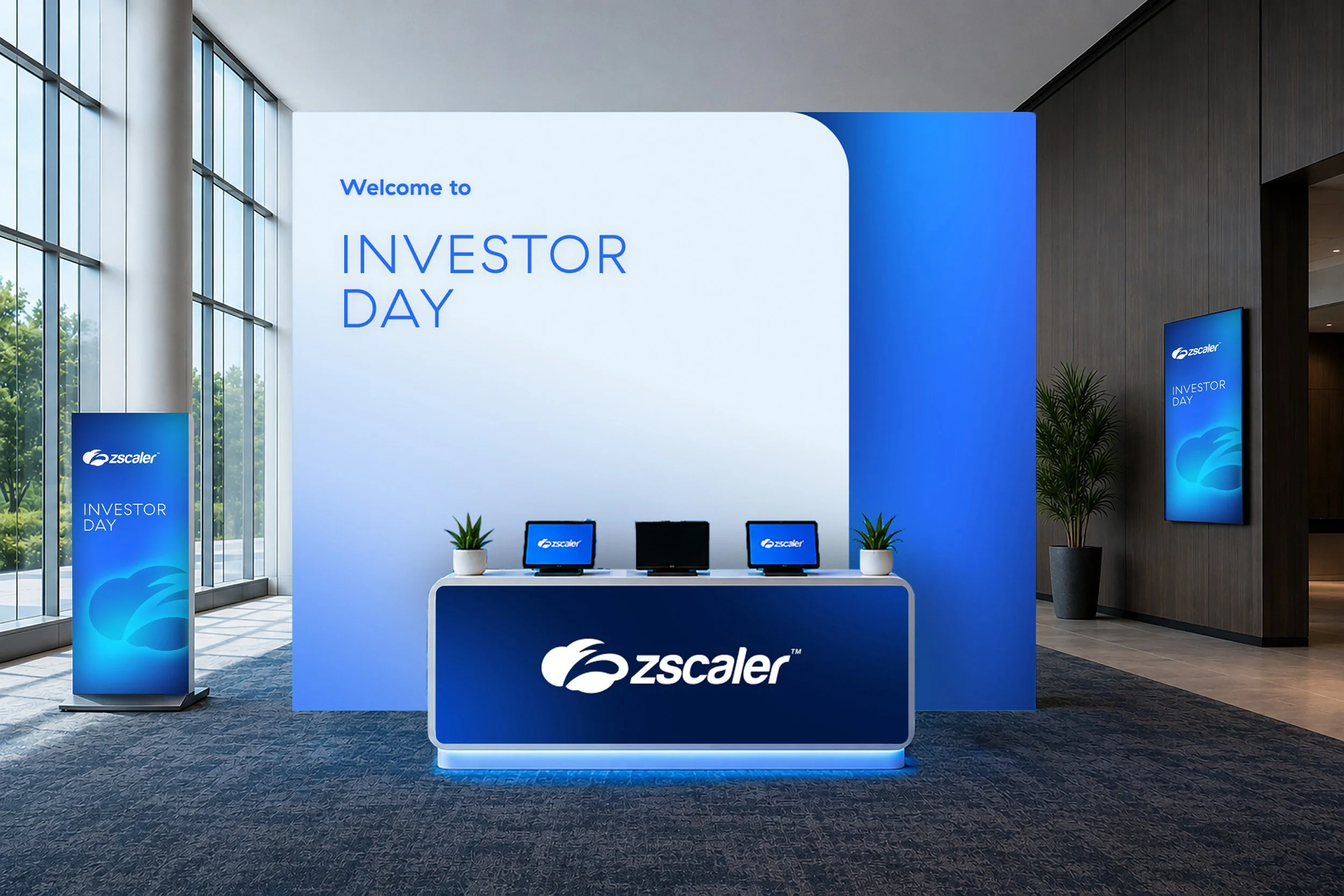
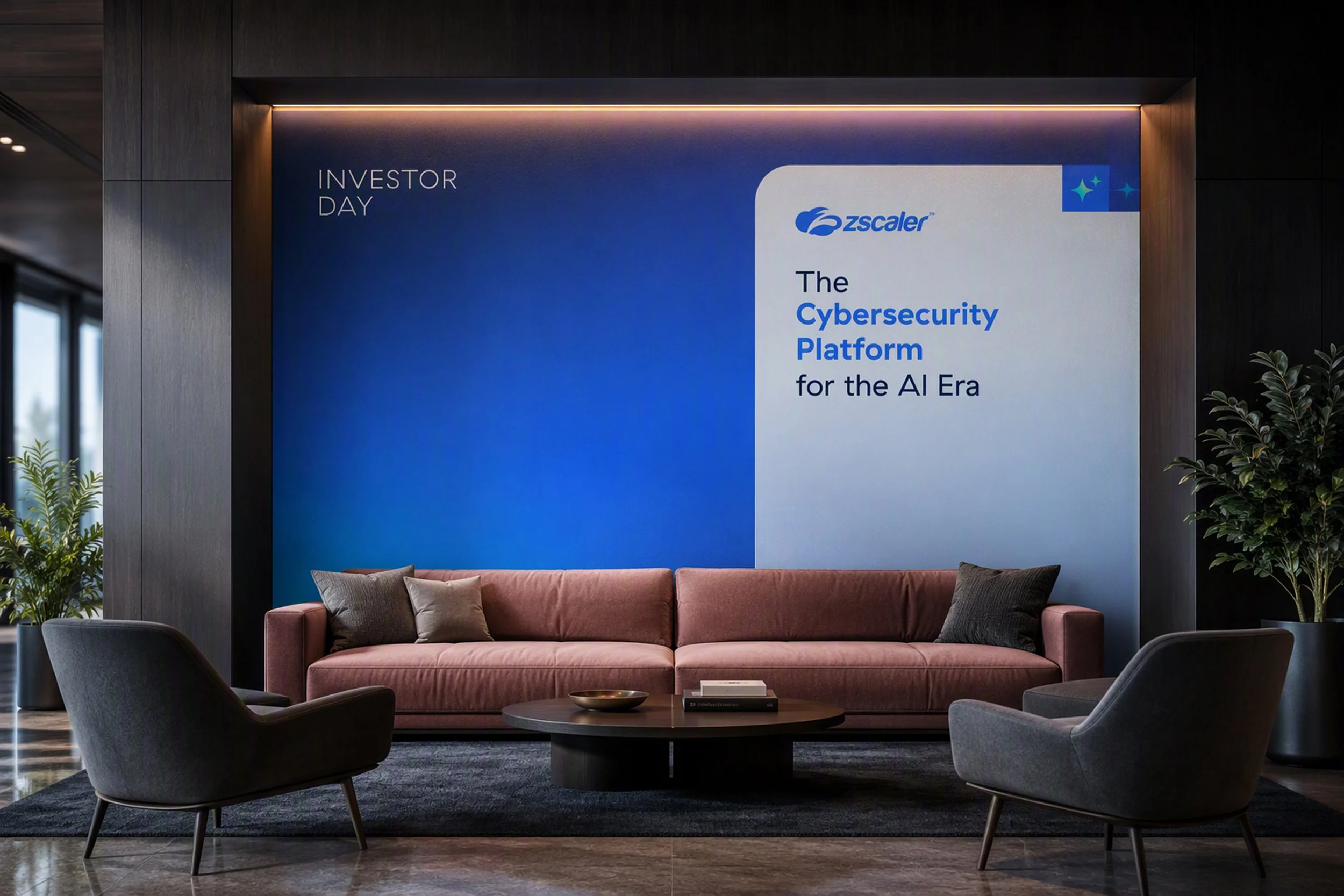
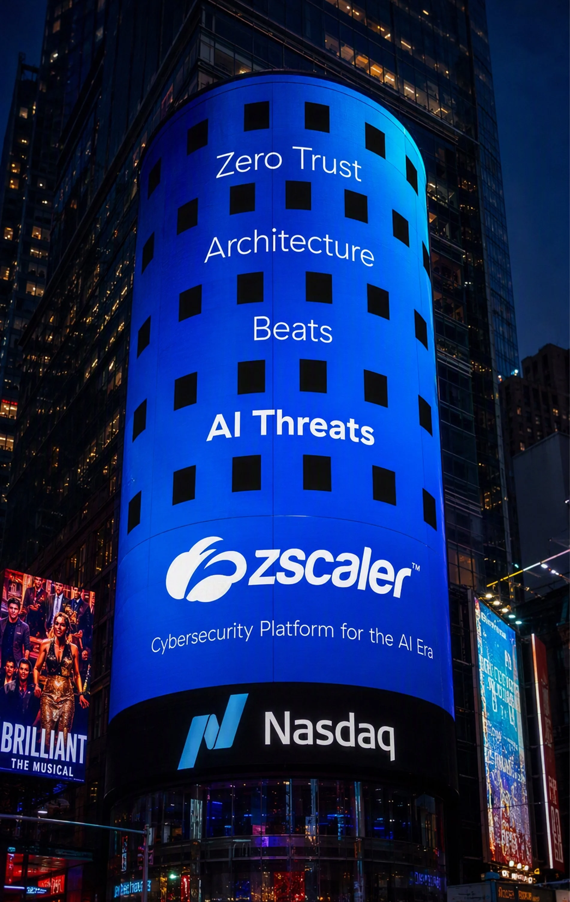
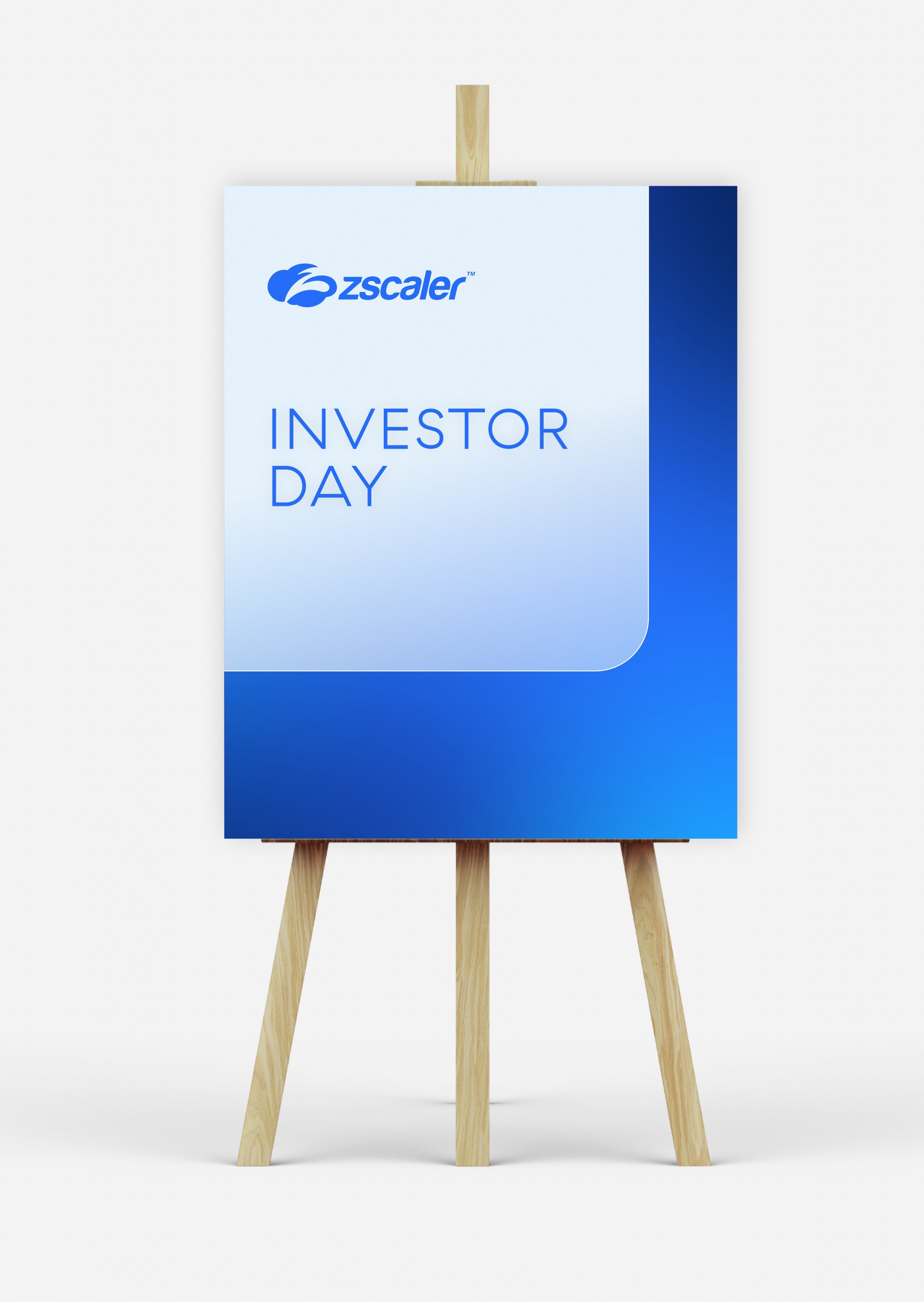
Working with our VP of Brand, I directed a shift from technology stock imagery to a simple and modern gradient approach that kept attention on Investor Day’s content. I gathered references, guided designers through color refinements, and presented three gradient options alongside the original concept to the CMO and VP of Brand.
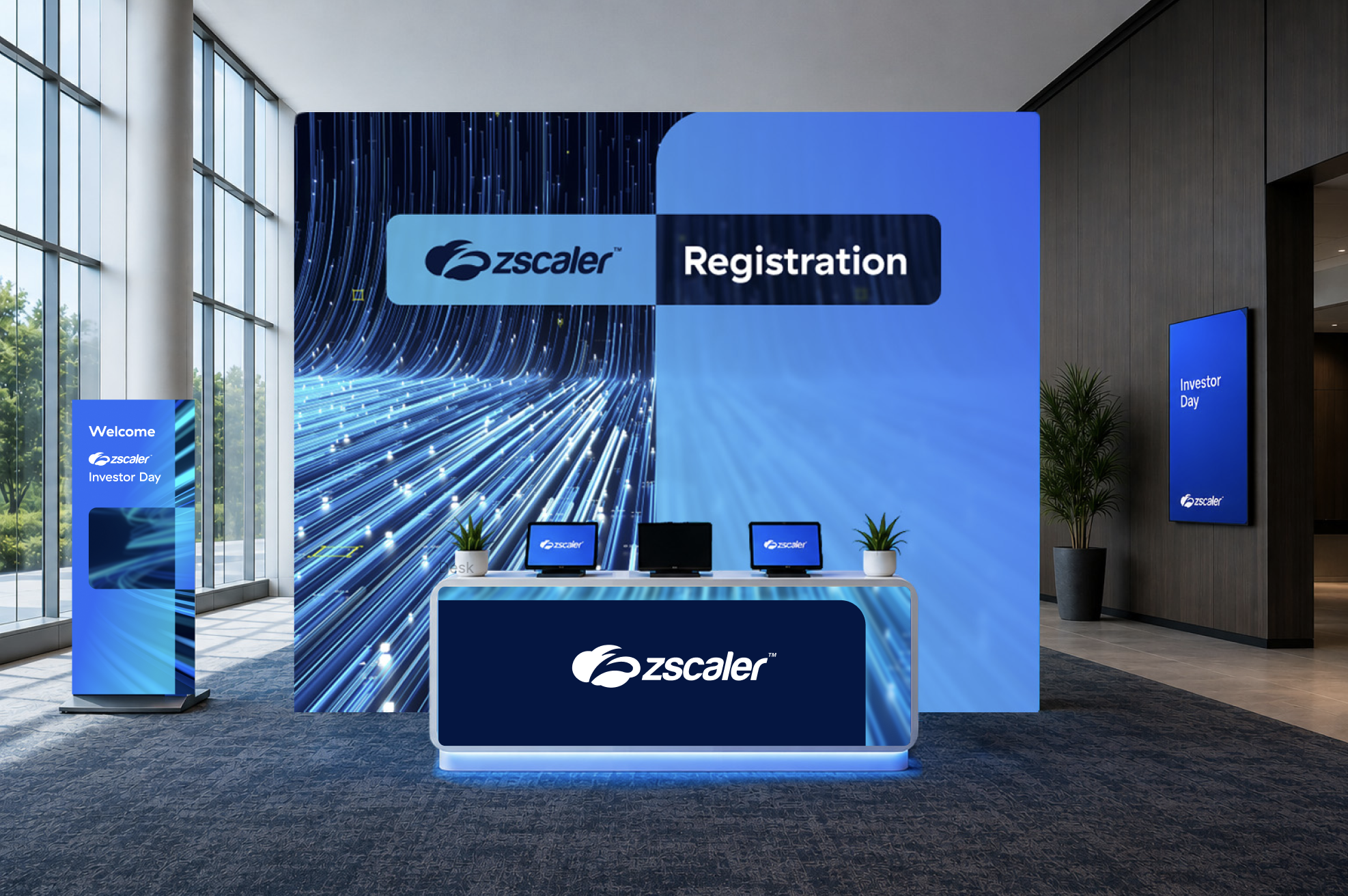
INITIAL DIRECTION
The initial concepts leaned heavily on technology stock imagery. Stakeholders wanted a quieter, more modern visual setting that let the content lead.

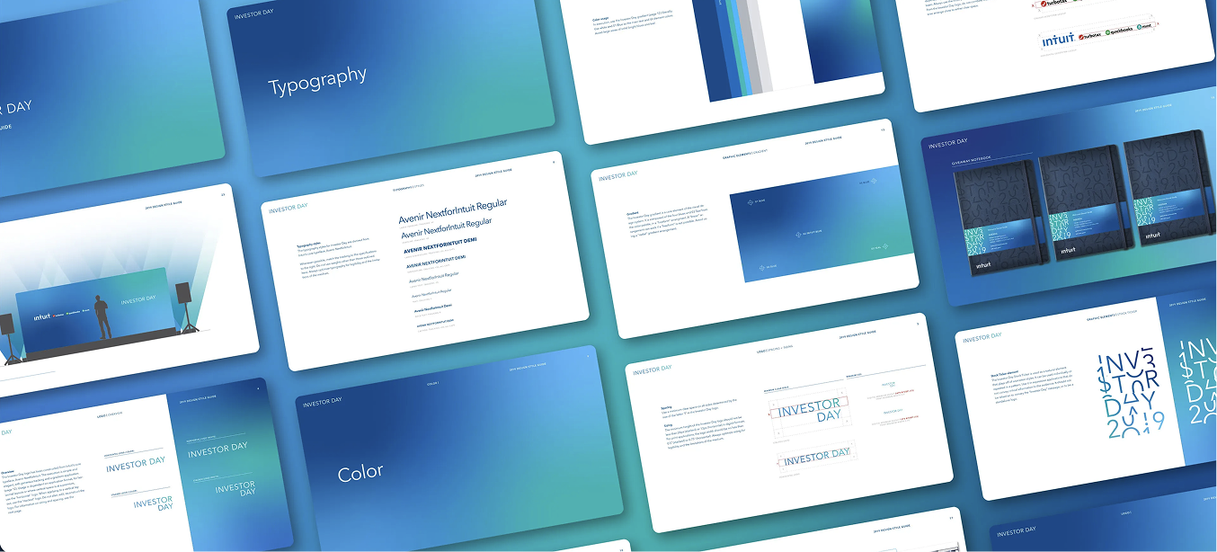
FINDING INSPIRATION
References from Intuit and other brands helped me align with our VP of Brand on a simpler, contemporary approach using gradients.

UPDATED CONCEPTS
The first gradients used too much accent color. I asked the designers for an all-blue version and alternatives with just a hint of green or pink. I presented the options to the CMO and VP of Brand, who selected blue.
FINAL RESULT
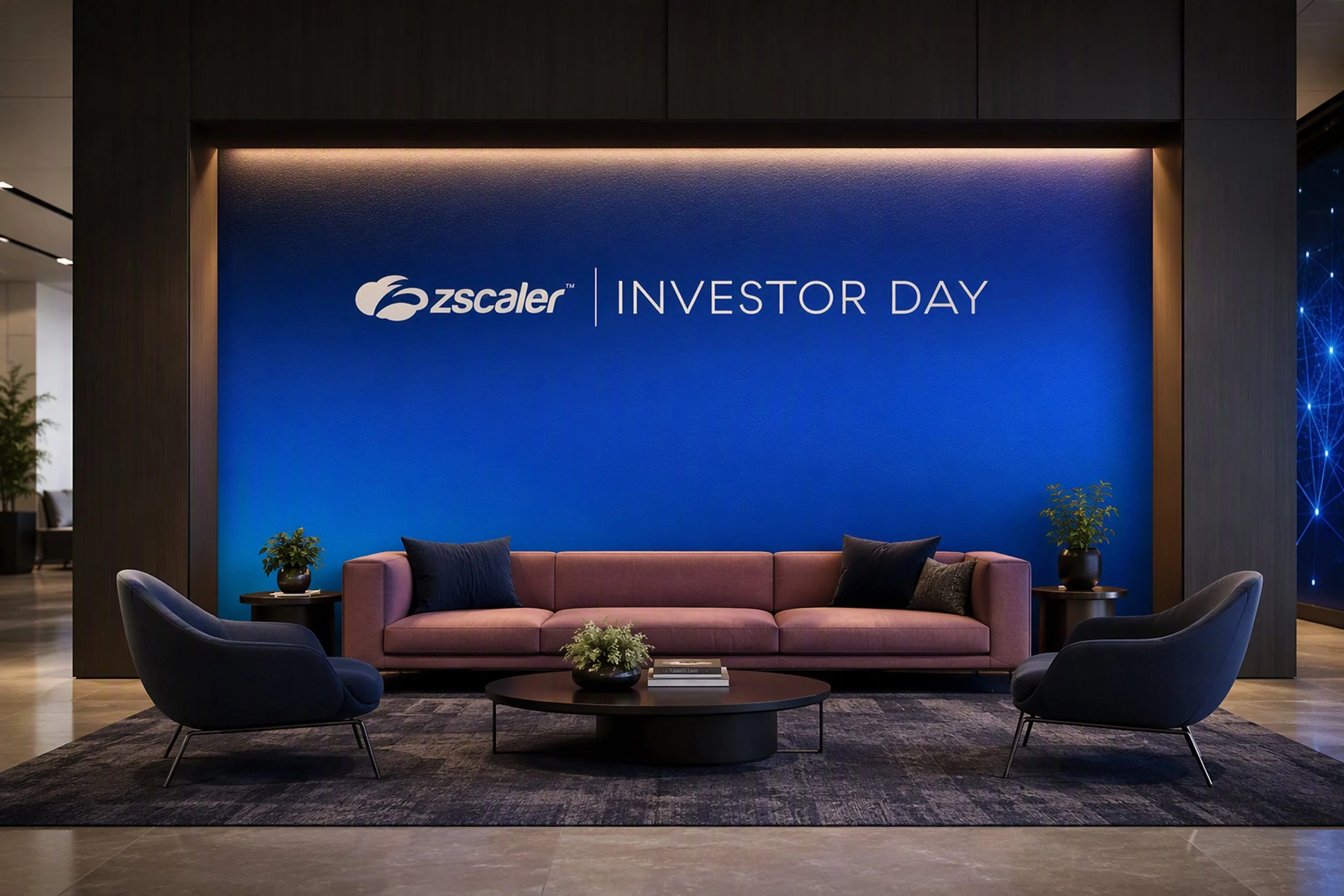
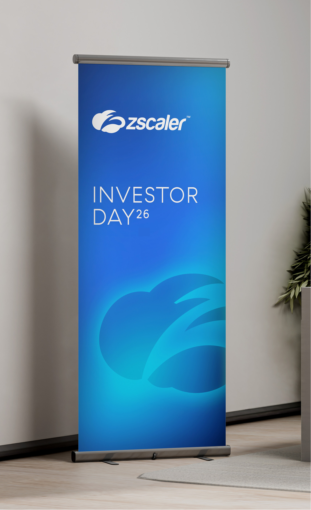
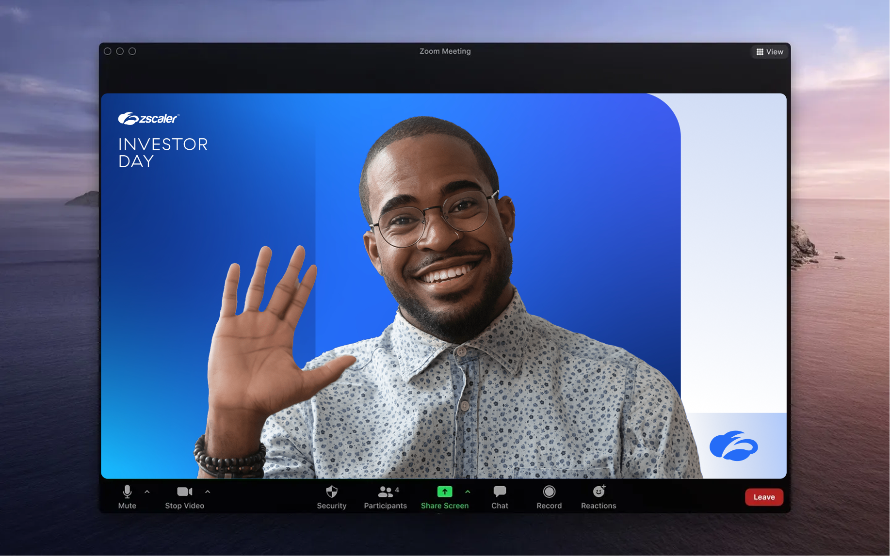
The blue gradient brought a modern, restrained look to registration, signage, branded environments, and digital touchpoints.
Designers: Katie Laughter, Shirina Haque. Creative Direction: Milan Klusacek